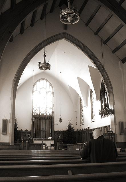
Taken inside my church while the power was still out from the ice storms on Wednesday... This is a self portrait... I intentionally blew out the light coming from the main window. I wanted that impact for this particular photo... it was intentional and not a mistake...
Statistics
Place: 10 out of 67 Avg (all users): 6.7391 Avg (commenters): 7.1613 Avg (participants): 6.6984 Avg (non-participants): 6.8276 Views since voting: 15702 Votes: 92 Comments: 35 Favorites: 3 (view)
Free Study 10
Critique Club Critique
(1) COMPOSITION (CONTENT) - I like overall content here, high ceilings and empty space meeting the emptiness of the church ( excluding you). I also like where you placed yourself – on the right side of center, and with a dark shirt. The top of your head is still below the wood in the background; it would detract if it were higher.
(2) BACKGROUND – The clean white walls and ceiling work well with the bright window. I'd like to see a few darker shadows.
(3) CAMERA WORK ,TECHNICAL – Well done. Excellent DOF. My eye is certainly drawn to the highly exposed window. I assume that a slightly less exposure time did not produce the high brightness you wanted; for instance, did a 4 sec exposure still give the eye catching brightness? I would guess it would have also intensified the shadows a little more which I might have liked better. Probably a tough trade off.
(4) DIGITAL PROCESSING ,TECHNICAL – Good change to B&W. It works well here with the dark wood, the geometries of the arches and windows, and with the emphasis on the light from the window.
(5) MY OPINION ON THE PHOTO – I like it. Eye catching and thought provoking. Is the intense light only in the eyes of the one in church?
This is a great shot. I like the lines, curves and angles. The blown out lighting brings a lot of interest to the shot for me. The humble body language of the man in prayer and the divine lighting entering the window bring an unusual balance to the shot. (From a technical perspective, I would NOT say this is lacking in any way, but the window may cause you some grief with the voters). This is one of my favorite shots in the members’ challenge this week. Congratulations – and good luck with the other voters. _ Gotcha - 9
I feel that this picture would have been sooo much better if the window in the background was not blown out. It seems to be an important part of the picture but has no detail.
Well taken photo. Sepia seems well used in this case. The glare in the stained glass - I don't know, it might be a good thing, but I just don't care for glare.
7 Swash
Nice hair cut ;)
I like the lovely big archway and the mood of this shot. Works well in BW.
Exposure feels off - too dark at very top and too blown out around stained glass window and roof of that area. I don't know that this would be easy to fix!!! It's a sure candidate for a PhotoShop job!
Like the way the arches at the right reflect the arch shape - nice light and shadow. Also like the sheen of the wooden pews and the positioning of the bloke.
Not what I'd call a postcard shot but interesting.
Beautiful!! There isn't a thing I don't like about this photo. I absolutely love the intensity of the light coming through that window. The composition is stunning, the tones are deep and rich. A 10 from me!
The light of the Lord. Looks like a place of solace for this guy in his time of need. I'd have left a little more of the color in to make it a little warmer, but this is really a nice image. Very peaceful. - Inspzil
You did a very good job with a tough lighting situation. There is no way to do this without the front window being too hot. Your foreground lighting and details are very good. I also like the black and white format. Smellyfish1002 (JD Anderson)
Nice subject matter. My only negatives would be that the window is a little washed out which makes it a bit distracting to the rest of the photo. It took me a second to find focus on the man praying. Beautiful church.
This picture is very nice. I love your composition, and while I don't care for the blown out window, I understand why you decided to do it. Great use of natural lighting in doors! Very calming and nice photo. - 9
This shot is pretty high impact for me. I love the coloring that you chose, and love the repetition of the arches, and the lines of the ceiling beams and the pews. I did not notice until I looked at it for the third time, that there was a person in the shot!! I would have loved to have seen this in color. 9. lhall
Tis is a very powerful photograph. First from a composition point of view, you were off center when you took it and the praying man is also off center. That makes for a very interesting "triangle" between the man and the center of the arch. I think the best part of this photograph is the way the light is pouring through the windows over the alter, almost as if the presence of a spirit is filling the church. I am guessing that is the meaning of the title. Very well done.
Great composition and perfect in b&w with this sepia tone.Perfect focus. Perhaps I had made it a little bit darker to see more of the window. But I´m not sure, maybe the man than would be too dark. Overall a great job. (8)
Wonderful composition, with just perfectly overexposed window. The man in the lower right conner, is not noticable at first and then queitly appears; this is what makes this picture great, to me. Great job!
Great picture. Slight bit of grainyness picked up in the white at the top of the arch. Other than that, which is far from terrible, the picture is wonderful. Great composition, and I like what you did with the given lighting.
Lovely architecture. I wonder if this would benefit from a couple steps to the right. More of a head on to the archway. I like the person in the photo, and while I'm not a huge fan of exaggerated lights or shadows, the light coming from the window is nice in this situation. Focus and clarity in this shot are great. The detail we get to see is perfect. Good luck in the challenge.







 Add photograph to your favorites
 Add photographer to your favorites


