Hey - this is a good start, but it has a few challenges:
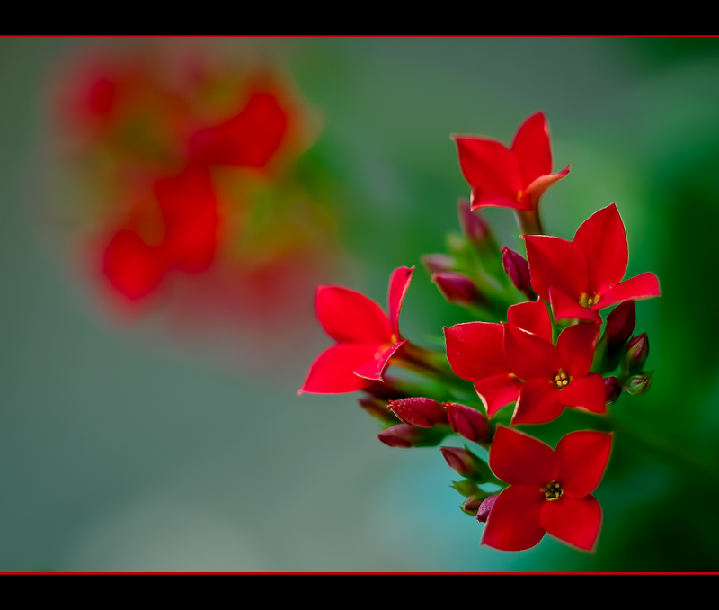
The background flowers on the left have odd blotches of red.
The reds are pretty flat looking - I mean, no depth in the areas that are red.
And even when making room for your frame obsession, I find this one pretty heavy in relation to the delicate subject.
Let's see what else you have. I know red is very hard to process so it looks natural. I usually do some adjustment on the color channels with levels to get it there. I'm sure there are other ways.
|





 Add photograph to your favorites
 Add photographer to your favorites


 Photographer found comment helpful.


