Challenge:Free Study II (Classic Editing) Camera:Nikon D1X Location: Outer Harbour Marina, Toronto, Canada Date: Dec 8, 2002 Aperture: f8.0 ISO: 1/250 of a second Shutter: 125 Galleries:Landscape, Travel Date Uploaded: Dec 8, 2002
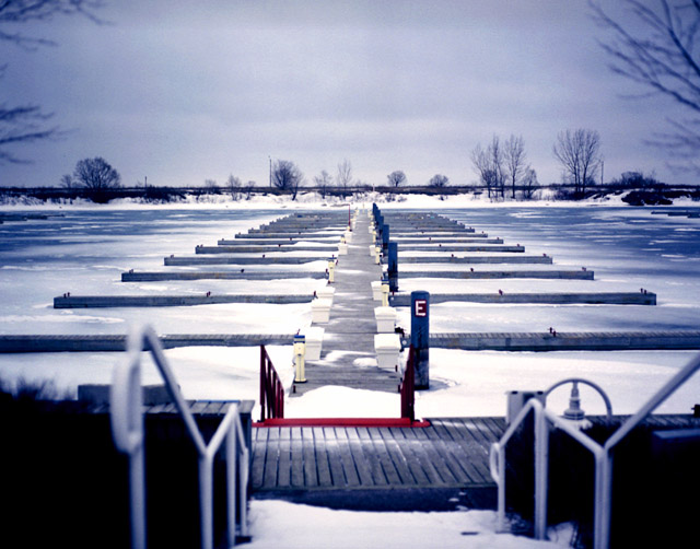
A cropped shot of the E-Dock pier where we kept our sailboat during the summer months. Not exactly a warm, friendly, nor relaxing place, this time of the year.
Nikon D1x with AF-S 28-70mm f2.8 lens set at a focal length of 40mm for this image. The meter was set to the matrix metering mode.
Statistics
Place: 33 out of 67 Avg (all users): 5.9121 Avg (commenters): 6.3636 Avg (participants): 5.9032 Avg (non-participants): 5.9310 Views since voting: 5372 Votes: 91 Comments: 25 Favorites: 6 (view)
its great how the stairs lead u into this photograph
however the trees in the corner left and and right trying to mingle and they should not
the little red and pale yellow present subtile but still strong
COMPOSITION:
Kill the bottom third of the photo...that's all, IMHO. I think that the stair railing not being symmetric like the rest of the photo really ruins it. It's too bad that the stairs don't line up with the pier leading into the water. (Is this by Ontario Place or Harbourfront?? I'd like to know...so I can have a shot at this setup :)
TECHNICAL:
Focus is great. I like how you used DOF to try and eliminate the railings. Lighting is nice and even...perhaps a bit overexposed in the middle, to the left of the 'E'. :)
ARTISTIC:
Michael, I think this is an awesome scene to shoot. I love the colors, the branches peeking from the sides. The mood is very nice. :)
OVERALL:
If it weren't for the railings on the foreground, I would say this is a perfect shot.
Best of luck in the future. Don't hesitate to PM me if you have any questions about this critique.
Wow... something I'll never see in real life unless I travel more :). I like this photo a lot. The composition is strong and the colours are very beautiful. I love all those blue and white tones. The DOF is a little bit distracting, but that's only a minor point for me. It's a really interesting scene.
You have leveled your horizon very nicely. That is something a lot of people (including myself) often forget to do. The pattern is nice. The horizontal lines in combination with the vertical lines on the deck are nice. focus and clarity on the bay seems good to me, however the stair railging in the foreground is a bit distracting to me. Otherwise a nice shot. Good luck in the challenge.
It is interesting to see all the patterns and lines here. I like the branches show in the upper right and left of the shot. The only thing that bothers me is the rail on the left side being slightly blurred. The other parts of the shot look good though and the detail is nice. = 7
Interesting perspective shot this, its just unlucky that it doesn't line up perfectly square, and that lefthand side railing is a bit distracting, but there's not much you can do about either of thoset :o) The blues of this shot really add to the sense of this being frozen - this shot may work well as a blue-based mono/duotone.
You have some interesting colors, shapes, repeating patterns, etc. This is a concept that works well, but it would be interesting to see it shot from a side angle as well. Although it would be against the rules for this site, I would like this shot better without the treetops on the horizon, and no branches on the left and right. Maybe cropping it down to the horizon would be an option. It would get rid of some distractions and zero in on the interesting components in the photo. I really like the way the red stands out from the bluish gray tones of the rest of the image! I know it would be though to do, but increased DOF to keep the handrails in focus would help, IMO. Nice shot, good effort braving the cold! JD
interesting idea... I like the pattern the docks make... might be better with out the handrails in the foreground... maybe a shot from down on the docks?
Love this photo. The vignetting is perfect. I've seen this done with filters, and can't wait to see how you did it without them. A very "old-timey" feel, and without resorting to sepia! Nicely done.
I'm actually bumping my score. The more I look at it the better I think this is. I like the DOF and coloring. The touch of red at the bottom is a nice touch. Only thing that may make this a stronger picture is if you were standing center of the railings on either side. Good work!
Great composition, I love the red enterence into the image, and the prespeciive formed by the docks leading into the horizon. Have you tried shooting from just before the red line? Great job, nevertheless.
very nice composition. i like the near and distant forms in the photograph. the near forms would look better in focus. the red in the center bottom is a great focal point that leads the eye out to the distance.
Neat, I've never seen snow-covered slips before. It looks rather surreal, and the blue-ish tone emphasizes that. It looks very symmetrical at first, but it's actually not, which I think is a little disturbing. I think I'd have preferred it to be more symmetrical (and I usually don't like symmetry) because the slips themselves are so symmetrical.






 Add photograph to your favorites
 Add photographer to your favorites


 Photographer found comment helpful.


