Critique Club Critique
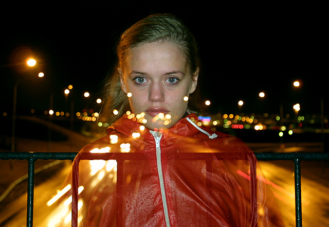
(1) COMPOSITION (CONTENT) – Quite good. I like her being centered, as the lights then tend to radiate out from her. It’s too bad the safety bars are so visible, as they detract from the photo. And if she were only a few cm taller, the lights would not hit her lip
(2) BACKGROUND – I would have like to have seen more well defined moving headlights; especially on the right, where they appear as one blurred object, except for the red lights.
(3) CAMERA WORK ,TECHNICAL – A good job. For this challenge, I might have tried to reduce the flash intensity so her face did not dominate; though it is a very pretty face.
(4) DIGITAL PROCESSING ,TECHNICAL – Excellent. No apparent changes needed.
(5) MY OPINION ON THE PHOTO – Very good idea and execution. The model tends to dominate, though, and she is not the one in motion. The lights in motion need to be enhanced some.
The success of the special effect actually distracts me a little from the motion, which is the ostensible topic. Still excellently conceived and executed; only tiny compositional improvement would be if her head were an inch higher or tilted back slightly so the lights would fall below her lips.
Excellent photo, -> subject is clearly defined and yet she seems to be speeding towards the viewer. Clean composition, engaging facial expression... It would have been nice if somehow the lights that are near her lip and chin weren't there... The ones near her ears look like earrings which is pretty neat :)
Also very interesting. Although I am not crazy about the centered subject... not symmetrical enough for me. Slightly confused about the effect achieved here.





 Add photograph to your favorites
 Add photographer to your favorites


