Arnit,
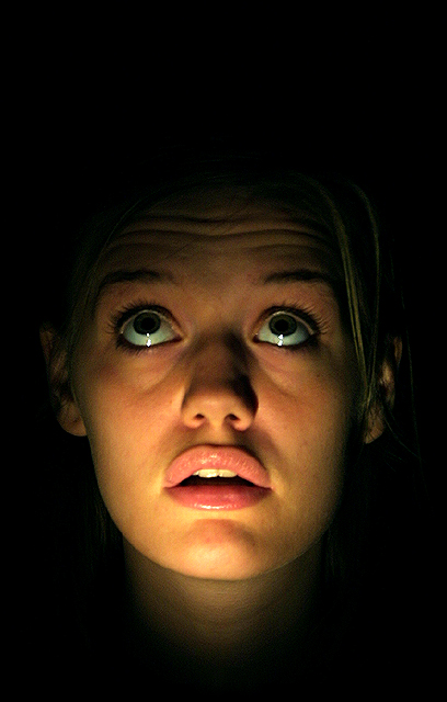
Very nice image for the Free Study challenge. I like the effect you've achieved with the lighting (and it's impressive that your model held this pose for 3 seconds!). One of the comments below mentions that additional negative space above the model's head might help the composition. I agree with this; I think extra space above the model's head would amplify the mystery of the image. What IS up there? What does she see?
I notice that you've entered this image into the Black and White gallery. Did you intend to enter a black and white version of the photo, but grabbed the color version by mistake? Just curious as this image obviously makes use of color...(I'd like to see a black and white version if you have one available).
I like the left/right crop that you've chosen. There isn't much distance between the model and the left/right side of the frame, but this works well here. It tends to increase the feeling of discomfort for the viewer....
I like this, but I think it would have worked a bit better with more space above her head. It's the kind of subject that lends itself well to negative space, to create mystery and tension.
Otherwise, this is technically good and an intriguing photo. I think perhaps the centred composition and symmetry makes it seem a bit too formal and static for this theme. Strong emotions are better represented in a spontaneous, less staged way, in my opinion. So, I guess my suggestion would be to take her off-centre, take a different camera angle, and leave more dark space in the area of the photo that her eyes lead you to look at. But leave everything else just the way it is (lighting, etc.) because it's really good :).
Didn't we see this in Blair Witch Project? Just kidding, anwway, I think it is well done. Low light like this, my camera would have freaked out and produced crap. The angle and framing/cropping is ok. I wonder what it would look like if she were at a different angle. The title goes well with the shot, and I think that the lighting on the subject is good. Definately different. If we didn't have experimentation though, it would be a truely boring world indeed. Good luck in the challenge.
Great use of dramatic lighting, combined with the upward gaze, really adds interest to this shot, as does the use of negative space. However, I personally wouldn't have centred the shot so much, and would crop so that there isn't so much darkness below the face, emphasising the darkness above. The focus on the subject is good, and the lighting hasn't blown out anywhere, which is impressive.
This is very simple, but I like it. I think it's the position of your eyes. If you had been looking straight forward, I don't believe this shot would have had the same appeal. Good job with the lighting. No hotspots!
The lighting here seems just a tad more on the left side than on the right. Other than that not much to add. Good focus, good composition. Subject just doesn't do much for me. =7
I think her eyes are too centered vertically... I think it would be interesting to have her eyes at the bottom of the photo... with lots of "unknown" negative space above her... kinda like "whatchu lookin' at?" hehe





 Add photograph to your favorites
 Add photographer to your favorites


