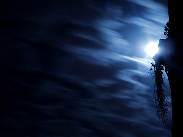
These clouds look naturally blurred (exposure) to me and it makes for a striking composition. Very well balanced shot and nice use of the foreground subject.
Being a designer, the first thing that strikes me about your photograph is it's potential for an advert or book cover.
You have made good use of the page with a lot of negative space which would work wonders for adding text!It also works well for the photograph.
Your clouds are blurred, and i can only guess that your edited that in post processing with some kind of motion blur? Perhaps you created the effect with a long shutter, but I would expect the clouds to be less shaky with the latter.
Regardless, I think it's a fairly unnecessary addition to the photograph. I would have liked it better without, however we all like different things.
My reasons for which is that the night sky kind of represents peace and quite and serenity to some degree, and having something as hectic as a motion blur takes away my perception of night.
I think your moon is perfectly placed, whilst it is overexposed, i like it that way as it's glimmering around the tree trunk which really gives this image a kick.
Please feel free to PM me if you want to discuss this critique
I really like this shot. Very creative and unusual. Keep shooting these. Just cause it didn't do so well doesn't mean it is a bad shot. Just means the voters didn't get it.
The moon looks a little overexposed but I like the overall artistic impression of the shot. The gradient of light from the right into the darkness on the left is good, and the silhouette of the balcony and vines gives it a romantic feel too.





 Add photograph to your favorites
 Add photographer to your favorites


