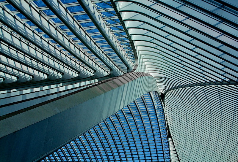
Congratulations on your strong (and well deserved) finish. There area number of elements in this photograph that conspire to make it highly successful. The colours obviously hit the mark for this challenge but I think the strong contrast also contributes a great deal to the overall image; throw in the great DOF / focus and the leading lines and we have a winner (well 4th place anyway!).
My favourite part of the image is the play of shadows on the main column but I also like how purposefully placed the confluence of structures is in your frame, right on a ROF intersection. Communicates intent; I like that.
Overall there isn't much that I can suggest to improve this - I think it's pretty much an optimal edit for this scene.
Quite an interesting architecture. Nice shadow and tone. I find the lovely blues and greens in the lower left hand corner to be MUCH more interesting than the mostly straight architectural elements. It fits the challenge, but I don't feel a huge connection with the photograph. I don't know what it is, but it's missing that one OOMPH that would push it up. I'll come back again before the challenge is over. --Not Participating






 Add photograph to your favorites
 Add photographer to your favorites

 Photographer found comment helpful.


