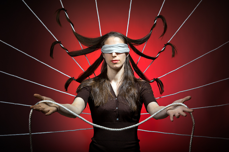
I don't like social networks. I understand they can be handy to stay in touch with relatives, but at the same time, I fail to see any point at sharing all these insignificant events of the private life with the whole world. I tried to depict this frenetic race to virtual "friends" in this photo.
Lighting setup:
- Main from upper right, 500w gridded strobe
- Fill from mid left, 400w softbox pointing down with reflector on the floor
- Backlighting achieved with a 400w strobe and red gel on a white background
Statistics
Place: 47 out of 167 Avg (all users): 5.7000 Avg (commenters): 6.9000 Avg (participants): 5.6024 Avg (non-participants): 5.8052 Views since voting: 2149 Views during voting: 403 Votes: 160 Comments: 11 Favorites: 1 (view)
As an artist what are you trying to say here? That we're all blind to the connections we make online? Anything else? I don't get the sense that you chose this subject because you're passonate about it, but because you felt you can do something cute/clever with it. That's the path to creating a good commercial image not fine art.
Gyaban, you mentioned in the thread that you were surprised at how low this is scoring. Here are my thoughts on possibilities why:
All of the technicals are perfect, as all of your images are. I would say that for this challenge, they might be too perfect. People voting don't really want to see exquisite lighting and focus. While these aspects are allowed, they should be the means to an end. While you are clearly trying to convey a point or raise questions in the viewer, ultimately the main subject of this picture ends up being the perfect studio set up, even if you didn't intend it.
Ultimately, I believe it is your background that lets you down. Its too "studio" and makes the image appear contrived, forced into fine art bounds so to say. I believe people might be lowballing you for it. Having her lie on grass or sand, or possibly standing by a brick wall, would have made this image more natural and I believe it would have scored higher. Even a plain black background would have been better.
Thats just my opinion of why I think you are being disappointed by the score of this image. I personally am giving you a 6. I value the attempt that was made at making me think about social networking, and it is of course well photographed. As I have mentioned, this is too technically perfect for me. It becomes almost clinical, and makes it almost impossible to make an emotional connection with it. This is a picture I could study at length to figure it out, but I wouldn't feel anything.
I hope you find this comment helpful and I certainly hope I haven't offended you. I am about 90% sure this is your image, and if not...ummmm, ooops! *runs away and hides*
I am taking a chance and assuming this is gyaban. I gave this a 7 because it is technically perfect, it's a highly creative concept and relevant commentary, but I do think I can guess as to why it's not doing as well as you've expected.
Silly as it sounds, it's too clear. It's all revealed immediately. There's an interesting concept, but not much of a story and no mystery.
These are certainly not flaws, but in this pseudo-intellectual challenge, I think the voters might be demanding an accidental masterpiece, so to speak, and this might be too controlled.





 Add photograph to your favorites
 Add photographer to your favorites


 Photographer found comment helpful.


