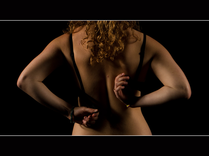
Funny Story. I didn't actually do this shoot solely for DPC. I was asked by a school magazine to a woman's back for the cover. From waist to neck... coincidentally. Fate?
Post-editing:
RAW conversion
Unsharp Mask
Vibrance
Border
SFW
First semi-nude shot that i've ever done. Kinda proud of it, to be honest. I'll post the full shots later. (P.S. why can't this be advanced editing??? I'de edit that pimple out first thing.)
Statistics
Place: 13 out of 67 Avg (all users): 6.0684 Avg (commenters): 6.4286 Avg (participants): 5.7105 Avg (non-participants): 6.1378 Views since voting: 5448 Views during voting: 559 Votes: 234 Comments: 18 Favorites: 1 (view)
I think the idea of this is excellent. There's a lot to like about it. I do actually like the horizontal orientation, it's not what one might expect. I noted your comment about the pimple, that is something that the eye is drawn to.
I wonder whether this is ever so slightly underexposed? I somehow feel like the body should be a tiny bit brighter (ok, that's just me nit picking.)
The one thing I would change is the border. Several of your commenters have mentioned it and it bothers me too. I'm not entirely sure how I would feel if it were borderless, but somehow this border really gives the feeling that you have chopped the legs & head off. The use of borders is such a personal thing, but if you belong in the don't like camp, then the score can really take a bit of a hit. I typically like a subtle border, but in this case, I think this would benefit from not having a border.
Overall a very well done image that completely meets the challenge.
Sarah
A good study, and the way the color of the skin moves from the whiter/brighter bottom to the darker/warmer top is strong. I don't know quite what I think of the border. I find it distracting, but I don't know what I would think without it.





 Add photograph to your favorites
 Add photographer to your favorites


 Photographer found comment helpful.


