Critique Club Critique
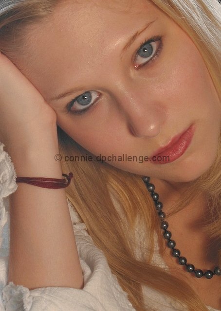
My first reaction to this was – what can I say about such a very nice portrait of such a pretty young lady. Then I looked at the comments, and I knew I was right. When you can get conflicting comments – too soft, just right; too dark, too bright; etc, then you know you produced what you wanted to.
(1) COMPOSITION (CONTENT) – Very well done. For me, this portrait is all about the eyes. You have captured them well, and positioned them well in the photo. All the other elements tend to frame the eyes perfectly. I would not have increased the color saturation at all (as some suggested). This would have just added more points for the viewer's eyes to wander.
(2) BACKGROUND – Well done. The softly lit blond hair in upper right nicely balances the white dress on the lower left.
(3) CAMERA WORK ,TECHNICAL – Very good. I like the focus. The only minor complaint I have is the shiny area above the left eyebrow and the reflection off the nose. If not for the challenge rules, these could be touched up easily in photoshop.
(4) DIGITAL PROCESSING ,TECHNICAL – Excellent, no changes I could recommend.
(5) MY OPINION ON THE PHOTO – A very nice portrait worthy of framing.
I'm not wild about how this portrait is framed. It think it should include more of her hair and stuff at the top of the pic. Maybe even her hand too. She could use a speck of powder so shes not so shiny. For my taste, it needs a little less light - Inspzil
Excellent portrait with great composition. The detail is so accurate it intimidates me. I know this is one of you guys out there with a really high quality lens, because it shows :-) Those of us with older, lower quality lenses and CCDs can never compete with this! Nice photography!
This seems washed out. It would benefit a lot from a little bit of levels adjustment in your post processing software. There is a bit of shine to the girls face, on her nose, chin and forehead. That could have been avoided with some powder over her foundation :). Other than that... I think the framing makes the photo seem flat overall. It brings out her eyes, but it makes her face seem like it's trapped in a tiny box. It cuts out part of her hairline and also the edge of her jaw. These are important boundaries to the face, without them we don't read a face very well, and when ALL the appeal in this photo is supposed to come from her attractiveness, you're cutting down a bit on that.
It's not a photo that really appeals to me thematically, so I've focussed on technical details. Overall, the photo doesn't really work for me.
Great portrait. Eyes are drawn to the highlight on the end of the nose and also above the eyebrow, maybe indirect lighting or bounced would have got rid of this. Lovely picture.
Good profile shot. It seems to have a slight white tint to the shot. I'm not sure if this was intentional, but it can be fixed with a little contrast and brightness levels. Great composition.
I like the position of this portrait. The only distraction for me is the tiny glare over the right eyebrow. I like the soft look of this without the focus being too soft. Overall nice lighting. = 7
This is one of a couple of images this week that are too bright, probably due to monitor calibration (using the greyscale below each photo, set the monitor brightness so that the borders between each block are clearly visible). Otherwise, this is a good portrait shot; well lit and nicely focused.
Nice soft portait. My only concern is the overall flatness of the photo. I would like to see a little more contrast so that her facial features stand out more. The crops is good as well as her pose and the beads of the neckless add a nice touch.
One of my highest for the week. I love the soft lighting and look on this girls face. The white clothing adds to the picture. I think this is a beautiful portrait! NICE JOB! - 10
Oh La La, beautiful woman. Nice image, I like the close crop and the isolation of the face. The angle plays well too. But, I bet others made comments on how it is too tight of a crop, not me, just perfect. Good luck. 8
Very nice portrait. The soft focus with the soft lighting is a great combination with this beautiful lady. My only nit pick about this is that I wish she were not putting so much pressure on her hand with her head. It pulls her eye brow at an angle that almost makes her look angry. If she had her hand up there, but wasn't supporting her head with her hand, then her eyebrow would lay in a natural position. Otherwise, I really like this shot. Great work. Good luck in the challenge.
It feel like this is a tad bit bright. Maybe more contrast. Very nice focus. The pearls necklace and bracelet are distracting and take my eyes away from her. She does have some pretty blue eyes!
Looks great, but seems a little too soft around the necklace. I like the light reflection in the beeds of the necklace. She's a pretty girl and makes for a pretty picture. Nicely posed, and cropped to look great. Well done.
Pretty blue eyes, pretty skin, hair.....my gosh, she is lovely. Sweet. This is a good portrait, casual, relaxed, lovely natural model. WOW. Like it. Good color and composition.
The light could of been bumped up a bit, but ya know it's nice. Justine





 Add photograph to your favorites
 Add photographer to your favorites


