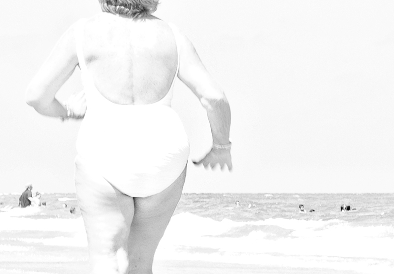
Unfortunately, the highlights on this are very overblown. Yet something about this is very appealing to me. It somehow looks like something from the 1950s. I'm not sure if it would loose that vintage feel if it were properly exposed, but if it did, I'd take the over-exposure just to keep that old feeling!
It's painfully high-key. The hands, as a result, blur; distractingly, into the sky. I think more, of the head, or none, is needed. The small bit of hair is either too much, or not enough. I don't know if it's really workable in the framework of the challenge (the back of the head is above the neck, after all is said and done).
I would have used levels and brought the midtones up and added more contrast and perhaps burned some of your hilights down, BUT OMG you made me cough up a lung laughing.. ++ points for Genius!







 Add photograph to your favorites
 Add photographer to your favorites


 Photographer found comment helpful.


