Greetings for the Critique Club:
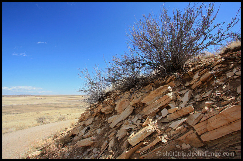
I didn't vote in this challenge so I'm looking at this with fresh eyes. I like the left hand side of the picture better than the right - the washed out landscape and the very smooth gradations of blue in the sky is very attractive. I also like how you've divided the image with a strong diagonal element. If I'm honest, this image isn't shouting 'chips' at me but none of the commenters picked upon that so you've clearly communicated enough chippiness!
I think the scrubby bushes atop the outcrop look a tad over sharpened - if you used a global sharpening tool you may wish to invest in something that allows you to selectively sharpen.
Of course the focus of the image is the crumbling rock strata and this is very nicely presented, the play of the light emphasising the texture of the rock.
Overall, although this is competent work, there isn't a huge amount of intrinsic interest in the scene and such your choice of subject probably placed a cap on the maximum score this would pull in.
Paul |






 Add photograph to your favorites
 Add photographer to your favorites

 Photographer found comment helpful.


