Greetings from the Critique Club
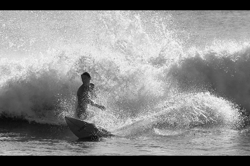
This is one that I find hard to critique. I like it, I gave it a 6 in voting, but there is something missing for me and I can't put my finger on what it is that is missing.
I think I would have preferred to see a bit more foreground included, the framing feels a bit too tight for me. The letterbox style cropping constrains the image somehow. I'm missing the feeling of the wide open space. As far as the B&W goes, I tend to like a bit more contrast, not so much that the spray of the wave is blown out, but enough to give a bit more of a punch. This is a very minor nitpick and is just my personal preference.
Overall a well done image, but I think with a few minor compositional changes could have got you a higher score.
Sarah
|





 Add photograph to your favorites
 Add photographer to your favorites

 Photographer found comment helpful.


