Greetings from the Critique Club:
First of all I need to 'fess up - looking at your histogram above, I was one of your 2s.You've been a victim of my prejudice of all things figurine and statuesque. I'm not alone but I'm probably among the most vehement. Now that I've said that, let me see what else I can offer...
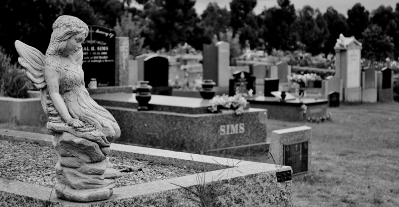
Your aspect ratio and consequent placement of main subject is eclectic, that can work but for me I think that's best done if you can balance the composition with some compelling features in the space so created. You've pulled off elements of that - the succession of graves pulling us into the image with the communication of depth. I think your choice of depth of field works against you, making it difficult to make this very effective though, the 'SIMS' letters are apparent enough to catch our attention yet out of focus enough to frustrate. Tonally, this is quite flat - I don't know what editing tools you have available to you but I think a boost in contrast or the addition of a carefully constructed vignette would have helped to create some drama.
When I look at an image, I like to see a photographic footprint - evidence of the choices the photographer has made and to be able to appreciate the benefits of those choices. Here, the placement of the angel does reflect a clear choice (so I like that) but it hasn't left me with an impression that the choice was effective.
I'm sorry that I don't like it more but hopefully these words offer a bit of a rationale as to why.
Paul |





 Add photograph to your favorites
 Add photographer to your favorites

 Photographer found comment helpful.

