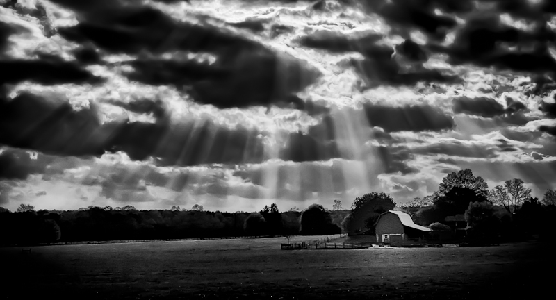
Went shooting the other day and on my way home from a very disappointing shoot, I saw this scene. Just loved the way the sun streamed through the clouds!
Snapped away and thought I'd have some keepers....until I got home and saw the results.
Two major flaws: first is I was shooting at ISO800, so the image was very noisy, and secondly, my camera metered for the sun, and not the barn...so everything was VERY underexposed.
I've tried to pull as much detail out as possible without artifacts, but sadly the end result is not what I would like it to be. Too noisy, and lacking in detail.
Disappointing for sure, but an important lesson learned!
Hoping for a 6+, but after 40 votes I'm going down to 5.9xx.
[Apr. 8th, 2011 10:01:32 AM]
Been sitting at 6.1 for better part of the week, but have dropped below 6 at 100 vote mark! Currently 5.98. Hoping some happy voters will push me over 6 again before close!
Statistics
Place: 41 out of 230 Avg (all users): 6.0805 Avg (commenters): 7.3750 Avg (participants): 6.1556 Avg (non-participants): 5.9661 Views since voting: 909 Views during voting: 269 Votes: 149 Comments: 13 Favorites: 0
I really liked this one, Garry. It's a very moody shot. The grass is nice and smooth and bright and textured, as are the clouds, but nice and contrasty. If it's not doing well perhaps it's due to the style of processing--some people dig details, but in this shot the... it almost feels like a water colour... that really makes it pop for me.
The vertical fingers of sunshine, as your title puts it, contrast nicely the horozontal stacking of the tones textures and blacks. The major finger (middle? WTF! :P) targeting the barn on the third is very nice indeed and while perhaps not as lucky or emphatic reminds me of this shot of Yo_Spiff's
The vignettes might sortof count against you, though (scoring wise?). It makes a dark picture darker (too dark? I don't think so, just trying to be critical, I quite like it), but the contrast between the dark outsides and light grass and bright fingers... very pleasing. Very pleasing indeed.
The one criticism I can pull against this is that the crop is a bit too letterboxed for my liking. It's hard to judge how an alternatie crop might make it feel, though, especially when regarding only the final one. I'm no expert on bordering but perhaps a top and bottom border might have squared this up while maintaining the composure, reinforcing the horozontal landscape and cloud stacking? Just a thought.
8







 Add photograph to your favorites
 Add photographer to your favorites

 Photographer found comment helpful.