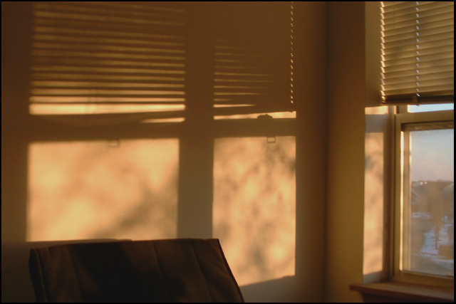
Composition (Content) I like the light on the wall and the shapes that the shadow makes. I would have liked to see some more attention to detail. Drop the blinds down so they are even with the window pane or have them all the way down, but open so as to give another element to the shadow on the wall. Where they are place now leaves for a messy look and distracts the eye. The chair on the left distracts from the shot. I feel that if it was out of the view your sun on the wall would stand out stronger. Moving the camera to the left to lessen the amount of viewable area out the window, or a crop to take that from the picture might also help the viewers eye from being distracted. With the window elements and the chair the viewer doesn't have a main focus. Leaving just the sun on the wall with the shadows would have made for a higher impact photo.
Background Good low light shot, not a lot of noise
Camera Work (Technical) Limitations of the camera prevent you from being able to apply filters or do much in the way of shutter speed and F/stop so within the limits of the camera this is a ok shot.
Digital Processing (Technical) Sharpening is good(Doesn't look like you over sharpened this photo).
Balance between light and dark is good. (Based upon subject matter)
Compression is good(No noticeable compression artifacts)
My opinion This is a good shot. A few minor adjustments and this photo would have really grabbed your viewer.
This is a very atmospheric image. It definitely puts me in that early morning mood. I'm the kind of person who can be hypnotised by shadows on walls, especially when they're as lovely as this. The colours here are beautiful and warm. I think I would have liked more of the chair to be in the photo, though. As it is, it draws my eyes out of the photo, looking for the rest of the chair. Nice work, otherwise.
I like the simplicity of this and how the shadows become the focus of the picture. The warm colors also give it an ambient feel I think. Overall, though, the picture seems a little flat to me, for some reason; I can't really put my finger on it right now. I will think about it though.
There is definitely something appealing about this. Not sure what the brown bit of furniture is, kind of the has the feel of moving house, the last morning in a much loved house.....
The mottled-effect of the light coming in (presumably through tree branches) is great, and the blinds are at the right angle too. However, having the chair in shot detracts from the overall image, plus it hides some of the wall being lit, which is a pity.
I think this one is rather nice. Nice soft colours. A little out of focus but that makes the atmosphere. Perhaps it would be more interesting if it was cropped so it was just the left shadow. (Not sure) Anyhow a nice shot to look at. (7)
While the concept is nice, the execution seems to be a bit off. The image seems too soft, as well as, the subject in the lower left portion of the image seems out of place, the image in the window has too much detail. B&W might've been a better choice, also. Just an opinion.
I'm not able to really understand this shot. The subject matter out the window is kind of uninteresting and the dark object in the foreground is distracting to the shadow. Perhaps moving the chair and moving the camera so as to no see out the window, or dropping the blinds so the light shines through them, but obstructs the view may make for a more interesting shot.
A little boring. Nice use of natural light. The window shade is a bit out of focus which takes away from the picture. If there was something else in the shot other than just the light coming through the window it might have caught my attention a bit better.
What a very pretty marble effect on the wall. I like the shadows and the color is great. I like the pattern. You did a great job to show part of the actual window in the shot. It gives a bit of symetry, without being symetrical, if that makes sense. Your focus and clarity are great. Very nice find. Good luck in the challenge.





 Add photograph to your favorites
 Add photographer to your favorites

 Photographer found comment helpful.


