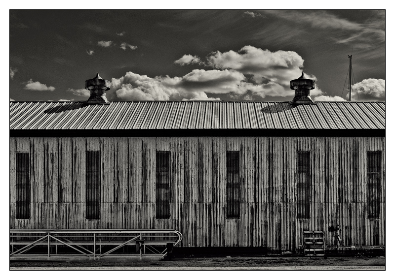
Light? Check. Shade? Check. Line? Check. Texture? Check. Form? Check! Check and double-check! It's all there! IMO This is a classic B/W study of light & form, I'm absolutely delighted with it, and I have a sinking feeling it will be lucky to see the sunny side of 5.5 :-(
That makes me sad. Prove me wrong, voters! I double-dog dare ya! I think it's really, really good B/W photography. Which is something I spent my life doing.
Statistics
Place: 84 out of 230 Avg (all users): 5.6319 Avg (commenters): 7.5000 Avg (participants): 5.7471 Avg (non-participants): 5.4561 Views since voting: 966 Views during voting: 259 Votes: 144 Comments: 19 Favorites: 0
A rich, beautiful piece of work. I think you're missing Tones on your checklist.
I reopened this page following Brennan's comment on my image, had no idea this was the 84th place. Such a shame this isn't much, much higher, ribbon high.
My first reaction upon seeing this was to raise my eyebrows, thinking "huh, now this is something." The fastidious alignment just aids all the more in emphasizing the starkness of the scene. Truly, the best part of this image is that it demands you evaluate it as an image, as a complete scene, one which is not its parts but its whole. Each little bit can be dissected and thought of individually, but mentally they always return to the whole. The ramp, the pallet, the stacks, windows... all their own bits and pieces but they melt back into the entirety of the image at their earliest convenience. A nitpick is I'm not sure how I feel about the mast, just because it seems to be aberrant to the order of the rest of the image.
I just perused The New West again today, and there's something reminiscent here.
Did you shoot this in the Dynamic BW mode, or RAW and convert on your own? It strikes me as a scene that would perhaps be well suited for straight from camera for the LX3.
Robert, knowing the game so well, you should have added at least a few pencils, or one tilted glass, a semi nude model and some chains and a few water drops. or a joke of sorts.
And I still need to know what is behind the sheds, it's too much like Hitchock this image not to suspect the unsuspected behind it.
At least the commenters averaged 7.5
It is disheartening to see that this image finished below my silly faced cow. I guess this is another example that subject matter counts for a lot for the 2 second voters of DPC (the majority of voters i would gather). My image was full of flaws and issues yet it scored almost 0.5 points higher.
This image of yours has all that you would want in a great B/W image, the straightforward and direct composition, the excellent control of light and shadow, the interaction of the lines and shapes, it all makes for a fantastic study. Well done Robert.
Well at least according to your note you can be proud of how well you know the voters. Two of my top five finished below 80th. I guess I need to amend my taste. I seem to have had only one other person vote with me.
All the more impressive an image coming from the Lumix.
Nice clean lines, well executed, good contrasts but is a little lacking in something to lock onto as a point of interest. All of it is the point of interest so I feel a little lost. But regardless, a good effort.
Very nice. you've got a great graphic sensibility, it almost looks like an ink drawing, yet you lost none of the documentary value. not an easy line to straddle.






 Add photograph to your favorites
 Add photographer to your favorites

 Photographer found comment helpful.


