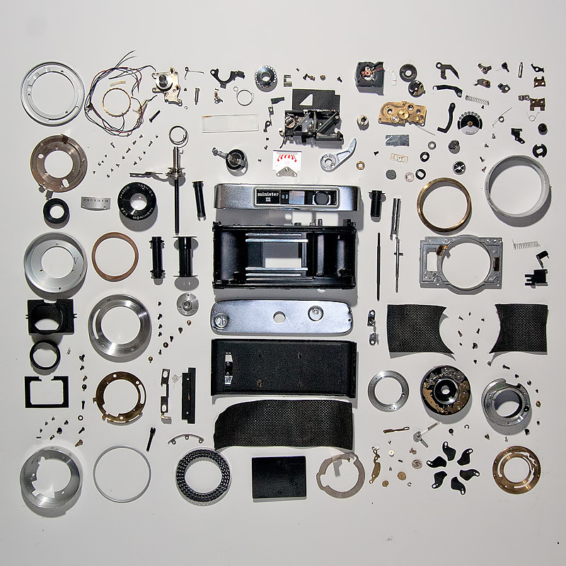
I lit this with an on camera fill flash and a main flash just off frame top. the idea was to give depth and definition to the various parts, to break them out of the viewing plane, and hopefully create a dynamic radiant shadow group. Sadly in this one it created a block of shadow and object in the middle with little white BG.
The placement was an attempt to group parts by function rather than some of the suggested more graphic approaches. The body in the middle the sensors and controls upper right, front of lens left, camera mount and back of lens lower right. Distribution was to allow understanding of how the parts went back together, rather than for an aesthetic.
[Apr. 5th, 2011 10:58:59 PM]
Since many of the comments were on the effort involved in taking the camera apart I thought i would explain that i started off trying to repair a stuck aperture blade on this camera. When it sort of exploded on me, I decided to tear it down for the bits. All told it took slightly less than two hours.
Statistics
Place: 5 out of 71 Avg (all users): 6.2128 Avg (commenters): 7.1765 Avg (participants): 6.0000 Avg (non-participants): 6.2551 Views since voting: 8594 Views during voting: 509 Votes: 235 Comments: 23 Favorites: 1 (view)
I'm not fond of the "disassembled objects on white board", but I will give this a little higher than some of the others due to the structure you've given your arrangement. Lots of cool little bits and pieces to look at here too.
The first thing that struck me about this was the cropping difference between the top and bottom, and the left and right sides. It feels a bit dim, and the hard shadows casting on other objects probably doesn't help.
In some of the other mass- disassembled shots, it seems like there are a lot more unique parts. This camera has so many round components, I wonder if there's a way to exploit that and create a more unique "grid" of parts.
I really like the order in this shot, although things do seem to be slightly leaning to the right as I look up the center. I also like that you left the strip at the bottom and top.
Nice job on arrangement and keeping with the vision that the person who suggested the challenge had in the examples they gave. Only flaws I could see is that using the square crop left a little bit of a bigger buffer at the edges on the top and bottom of your frame. Other than that... excellent.







 Add photograph to your favorites
 Add photographer to your favorites

 Photographer found comment helpful.


