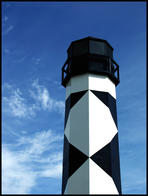
Composition - Really unique lighthouse. This is a great subject for a picture. It is really well taken and really well framed. The thing I like most about this pic is the light/shade contrast in the diamonds. I think I would've liked to have seen the bottom of it if the landscape was friendly enough to allow for that.
Background - Hard to go wrong with a nice blue sky like that. Polarizer? It looks like it to me. The sky is sort of dark blue which may be from the polarizer or just the time of day. It looks a little unnatural to me above the lighthouse.
Camera work - Couldn't be better
Post processing - Maybe a little work with the blue to make it look a little more like sky.
Overall - I really liked this picture when I saw it, and still do. You picked a great subject to shoot and did a nice job with it. The only thing I would change would be to move back a little and get the entire lighthouse with a little background stuff. I think it might add a little more color and verve to the image. - Inspzil
This is a difficult shot to critique for me. Shades of blacks and whites with this level of extreme contrast are not easy to shoot. I love lighthouses, so it has my interest. The blue of the sky is rich in color and the detail is clear throughout the picture. The contrails are a little distracting to me but there’s not a lot you can do to fix that short of re-shooting in an hour. I want to see something else in the picture to give me an idea of the size of the tower. (Only because it almost looks like a toy). The black frame is a nice addition. Good Luck – Gotcha 7
the absolute starkness of the light house is somewhat disturbing to me. I have come back for a second look and am bumping you to an 8, as everything is great with this shot. The more I look the more I like,,, I'll make it a 9.
this is fantastic! i adore the very starkness of the white, black and blue together. i also love the light you captured it in--makes it almost seem surreal. great job!
Love lighthouse pics. Can't wait to see where this one was taken. The sky is so pretty and so blue, I'd almost like to see a bit more of it in this photo.
This is one of my four tens in this challenge. I love these colors, and it's not a low-light, so your phocus is phenomenal! The only complaint I have is that there appears to be an airplane contrail in the clouds that messes them up a little. Obviously not in your control, and it's the only flaw there. Good job!
I really like the simplicity of the blue, black, adn white in this shot. The geometric shapes are really eyecatching, and the clouds are a nice addition as well. This would look really good hanging on my wall (hint, hint)! 10
This is an interesting light house, and a nice sky, but I think there are more interesting things you could do than just place it on a third. A steeper angle (ie. taken closer to the base of the light house and looking up) would be more dynamic. Otherwise, it is techinically very good. It just lacks a bit of interest.
Good composition, generally. I like your POV-orientation, to make the patterns on the lighthouse symmetric. Good work. Only comment: Should be off-center OR tilted, but not both. Great contrast.
I really like the color contrast of this shot. The black and blue and white go really well together but it looks to me like the tower is a little crooked.
I really like the harsh black & white against the sky. Too bad there were not any clouds the day you were shooting an all blue sky would have looked great. Nice capture of the shadows on the left side of the tower. Good framing. = 8
Hmm.... what can I say about this one... :o) Hmm.... the tower could do with being rotated about 1 degree clockwise, since the main grey/white boundary line is very slightly angled. Other than that, the composition is good, the colours contrast well against the background sky, and the RoT is observed to reasonably good effect.
Awesome lighthouse. I wish I lived somewhere by a lighthouse. I like the black and white color if it. I don't know but it seems to slightly lean to the left.
Great color composition. The black is really black the white is really white, looks awesome against hte sky, and the black border fits in perfectly. Well done.
what a wonderful shot!! I really like this one a lot. The angle and framing/cropping are great! I really love the lighthouse against the blue sky and the clouds are beautiful. Your focus and clarity are supurb! What an excelent job you have done with this. I could hang it on my wall for sure. Good luck in the challenge.






 Add photograph to your favorites
 Add photographer to your favorites

 Photographer found comment helpful.


