Greetings from the Critique Club! You asked for an in-depth critique on your image and here it is:
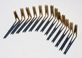
First response is a snicker - Beans! What an idea... I wonder how you came up with it. The little ends of the beans give this a whimsical flair. The color is good, and the background color also works to compliment the green of the beans. Reflections add an extra dimension. Lighting is good, as well.
This image has no content to speak of, but then you read the title and stop short. Perhaps it's just me - but I feel the title is a bit of a non sequitur in the face of beans. The depth of field is a little off - the beans on the outer limits are out of focus. And lastly, I feel the border is a bit heavy.
You scored very well - good for you!
Best wishes,
Alicia
|






 Add photograph to your favorites
 Add photographer to your favorites


 Photographer found comment helpful.


