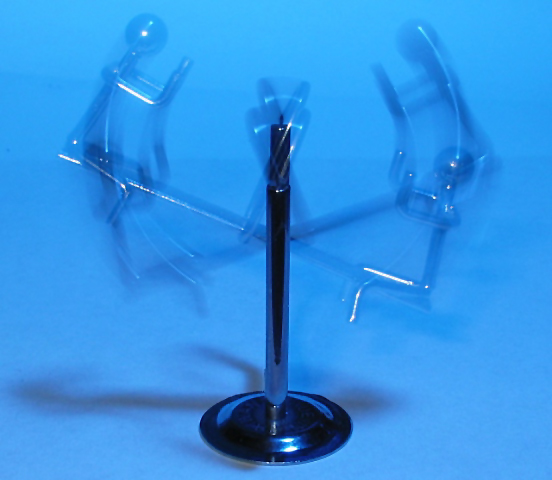
Composition - Nice looking little conversation starting piece. I can't say I've ever seen one so I am intrigued to know exactly how it works. The motion depicted is adequate for this challenge, but not great. I think a little bolder version of the figures at top and bottom positions would've been better. They are there certainly, but a little too opaque. The blurry thing moving up and down between the top and bottom looks really good. I think that the subject of this pic could have, with a little extra exposure, made this image do better than 50th. Actually, the exposure with the figure on the left at the top is good. Its just that when the figure was at the bottom on the left that things got a little thin. I think the lighting in the picture is a little flat and the angle of the picture is okay, but could be moved to accentuate one figure to give more of a focal point to the image. Overall, the composition is sound, but not overwhelming.
Background - If I had one thing to change in this picture it would be the background. Basic black is my first choice. If not, something darker than what was used. I think the contrast between the figures and the background would really serve to make the figures stand out from the page providing a little depth. It might also hide the shadow at the bottom of the base a little better. This might have let you get a little more creative with the lighting to provide some planned shadows of the figures.
Camera work - The way the picture was taken, the camera work is adequate. A little more exposure with the left figure at the bottom would've been preferred, but you can't have it all. Aside from the twice aforementioned exposure issue, it is well done.
Processing - I can't tell that much was done to the photo, so that's good.
Overall - This has the potential to be a very good image. The start of it is solid here. A background change is the thing that stands out to me the most. The other changes will probably follow in natural order with that single change. This is not a flashy photo, but definitely solid in the way it was taken and with its subject matter - Inspzil
This is intresting.
Does your photo fit the Theme? Yes Theme score (8)
Color: Color is good since there is not that much to this photo. (6)
Composition: Well I will say that your shot fills the screen nicely. I think the
subject is a tad bit busy. (6)
Focus: Well since this is a blur shot, there really is no focus except for the
pedastal. Which is in focus. (7)
Background: OK down to the nitty gritty. I feel the blue was not a great choice.
I also used blue for my background and I am paying for it. I should have gone
darker. I think you chould have gone lighter. maybe white. That would add
contrast and a nice shadow. That I think is needed here for this. (6)
Lighting: I am big on diffusing light. Notice the harsh reflection off the base. The
eye most always goes to the lighest part of the photo and this can cause for a
distraction and it does here. (4)
Score overall. (6)
Laughed when I saw your shot. I have one just like this only they are on skis. I searched the house but couldn't find it. LOL YOU did way better then mine would of been. Good job, good action.






 Add photograph to your favorites
 Add photographer to your favorites


