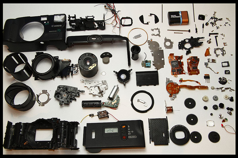
This is really in the style of the examples that the person who suggested the challenge intended. Nice job on that! Only minor flaw I could bring up is the camera body spilling out of the frame. You could have used a bit of a buffer around the edges of your background.
It's messy. So many pieces crammed into that little space, huh?
My biggest gripe here is the bottom horizon being so unordered angled/tilted. It's a tight crop, almost feels accidental. I think cropping more would be the answer. I would try 20px on each side (30 on the top) and see if that helps to make it more dynamic.






 Add photograph to your favorites
 Add photographer to your favorites


