I think that we're all connected, and the purpose of meeting others is to enrich each of our lives. So when that stranger walks away, it is a loss to us; a piece of us is lost...
Statistics
Place: 167 out of 167 Avg (all users): 2.7551 Avg (commenters): 3.4286 Avg (participants): 2.7706 Avg (non-participants): 2.7426 Views since voting: 1652 Votes: 245 Comments: 23 Favorites: 0
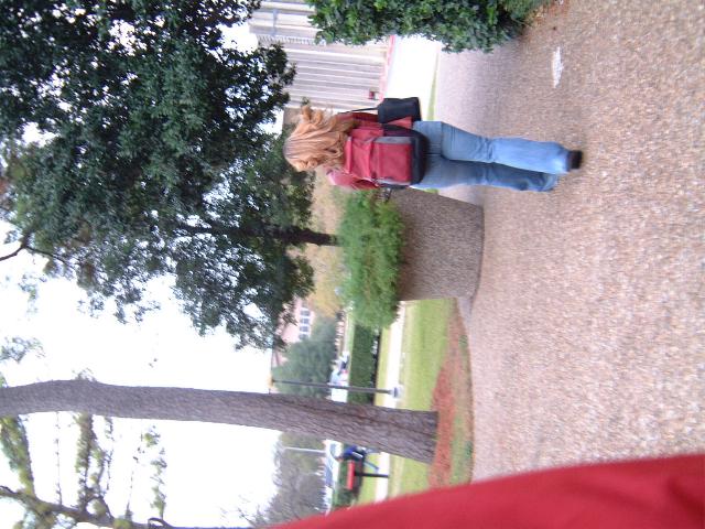
Would have helps had the person in the background were still behind the tree, helping isolate your subject. I'm a little confused how it can me both a "stranger" AND a "part of me." Would also have been easier to evaluate if it had been rotated into the vertical orientation.
I'm wondering if you uploaded the wrong version of this. The picture has potential but the red on the side needs to be cropped out. The fact that this pic is on it's side indicates that you may have entered the original, and not the edited version. I'm sure a little reworking gave you a nice image.
Apart from obvious rotation issue, the photo doesn't grab me. Seems more out of focus that showing motion - the rest of the image chould be sharper. Not keen on inclusion of red element at left (bottom).
1)Does the Photo fit the theme? (2)
2)Color:(4)
3)composition(2)
4)Focus(3)
5)Background(3)
6)Lighting(6)
7)Relavancy of the Title(4)
Overall Score: 3.42 rounded to 3.
Commentary: Sorry I was harsh on the scoring but had I not used my new method
It would have been evan worse. There seems to be nothing special
about this picture. You tried to be intresting by leaving the photo on
its side, and by doing this you made it worse. Sorry. That was just
my oppinion. I gave a 6 on lighting because you used Shaded light
on what appears to be a cloudy day. That is the only thing that you
did right here.
I find myself tilting my head. The title suits the picture making it feel better overall. Though the picture itself lacks in overall appeal. Could have been better focus. and the red sleave (?) in the shot could have been removed with a better crop. though with teh title the sleave is suiting.
This photo makes me dizzy (so I guess it has to do with motion), I have to turn my head to the side to view it. Not sure if it was intentional or not, but you should try rotating your photo 90 degrees so that the horizon has a horizontal orientation. The sky also seems a bit overexposed, and the cropping would look better if it was tighter.




 Add photograph to your favorites
 Add photographer to your favorites


