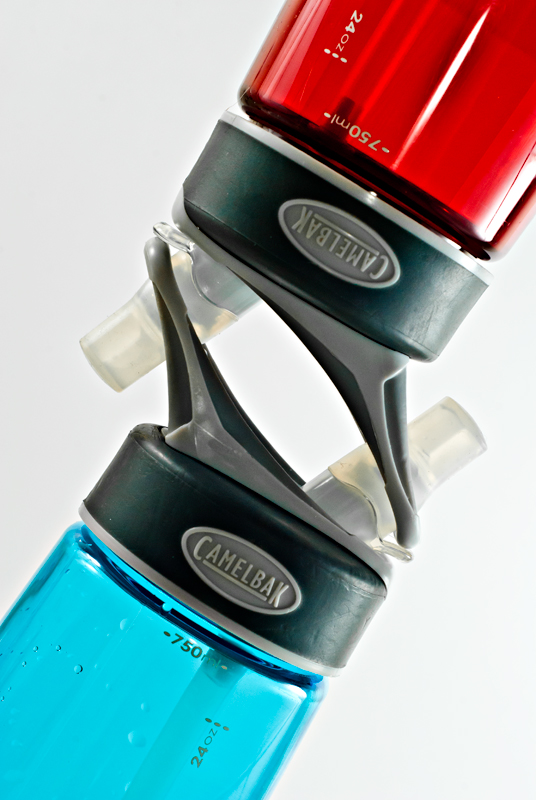
I like the diagonalisation of this. Negative space concentrates the eyes on the subjects.
Colours are nice and rich. I gave this 6 'cause it fitted the subject of the challenge, is nicely composed, nicely lighted and sharp. I didn't score it higher cause I didn't find the subject very engaging, to be honest.
One thing that struck me was about the blue bottle. The few drops of water in the blue bottle are a little out of place, I think. I don't see the counterpart drops in the red bottle, and I find this image so wonderfully symmetric that I feel disappointed it's not there :) I think the image would have been better either if they weren't there at all or if they were also on the red bottle. Not sure if it'd've made me score higher though. I'd have to see it otherwise.
I think what hurt you in this shot was the subject itself. In my opinion, water bottle just is not interestig enough to make compelling shots out it. So to be successful the shot is really going to have to have a 'wow' factor (tough in basic editing) so while you have a technically sound shot here that would do well for stock photography or even an ad for camelbak, it's not enough to elicit comments or votes from the viewers. if i could change anything about the shot it may be the lighting. not sure what you're working with for lighting so that may not be possible.





 Add photograph to your favorites
 Add photographer to your favorites


 Photographer found comment helpful.


