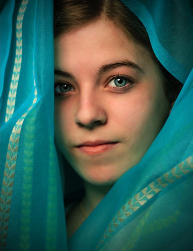
I once again turned to my wonderful daughter to be my model. I could not figure out an exotic setting, so I thought I would go for the scarf look. I found a wonderful roll of fabric in the basement. My wife is an interior designed and I guess this is fabric a client picked out but did not use. I used natural light because I know nothing about lighting. In this shot she is lying on the floor with the fabric bunched around her. I think the composition is OK, but I still have a lot to learn about processing.
I think I am going to regret this because I had a decent pic for the alternative Water Bottle challenge. Plus, I suspect the more experienced photographers will tend to go with this challenge and the less experienced ones (like me) will gravitate toward the Water Bottle challenge -- so the competition will be tougher in this challenge. Oh well. I had fun at least until the scoring starts.
Statistics
Place: 48 out of 95 Avg (all users): 5.6332 Avg (commenters): 6.6667 Avg (participants): 5.3519 Avg (non-participants): 5.7200 Views since voting: 1431 Views during voting: 456 Votes: 229 Comments: 6 Favorites: 1 (view)
Hey Mark. I gave this a 6. You have some good things going on here. I like that it isn't hyper edited and the pimping you did to her eyes is nice and clean. My tendency is to go borderline overboard and I would have probably done just a bit more sharpening on her pupil to make them pop a bit more (sounds gross that I want her pupils to pop). I like the angles of the scarf. brings a couple of good diagonals in and the patterns on the material bring a cool texture with out being too heavy. A couple of things that I think of that could improve the score on this image. First is the color on your models face. Working with veils (at least in my limited experience) is challenging in that the color and/or tone of the veil is often translated to the skin. What this gives you here is a skin tone around her cheek and jaw that is bluish-green. That can be taken care of in postprocess with various layers and masks. I think that if her skin tones were skin tonish all the way around, this image would be a bit more striking. The other thing (and this is one I have made several comments to on other images) is the angle at which you shot your image. You have a pretty much straight on level look. Had you come from above a bit your model would have had to look more intentionally into the camera and allowed her eyes to stand out even more. Shooting from above would allow more of the whites in her eyes to frame the pupil and then stand out more and possibly make more of a connection with the viewer. If you look at some of Librodos straight on portraits they still tend to have the models face down slightly causing the eyes to have to look up to connect with the camera. Gives them a more intentional purposeful feel to the gaze rather than just an "ok I am sitting here, take my picture " kind of feel. All that said, you have a lovely image here (just checked out your portfolio - is this your 13.5 yr old?) Is it DPC eye candy? Nope. But it is an image that you and your model should be pleased to have - DPC be darned. ;)







 Add photograph to your favorites
 Add photographer to your favorites


 Photographer found comment helpful.


