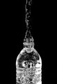
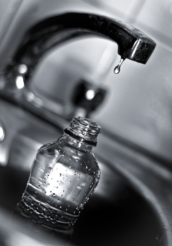
I like the s-curve. And the water drop. And the tilt.
Not sure it'll grab most people though. I think sub-5 for this one.
[Mar. 16th, 2011 08:37:58 AM]
Well I think it's going to do better than I thoguht... might be over six, hopefully!
Processing.
Lightroom auto tone with some curve, contrast and lighting variations. Topaz adjust for some pop (mostly on exposure and areas thereof, a smidgen of detail boost too). Topaz detail (for colour levels, and probably some detail boost too--can't remember). Lightroom again (clarity and contrast), and boost vibrance and saturation for black and white editing. Silver efex pro (contrast, structure and colours, all global). Lightroom again. Change white balance for blue overlay, split toning, clarity boost, export upload.
There was some hdr efex in there someplace too (lightly applied though).
This is my first shot entered with my 50mm lens. Doing well!
Post
Thanks to Steve for the blue-tint idea. I had it sepiaed. Blue gives it a much better feel.
Statistics
Place: 17 out of 121 Avg (all users): 5.9251 Avg (commenters): 6.4545 Avg (participants): 5.7059 Avg (non-participants): 5.9886 Views since voting: 1105 Views during voting: 378 Votes: 227 Comments: 13 Favorites: 0
Nice shot. I gave you a 7. You caught a nice, crisp drip. What I really liked was the water tension holding the overflow together in the bottle. You just know that the "last drop" won't fit. It creates a moderate amount of dramatic tension, but it's still just water. The theme, as you know, made it difficult to make a super interesting shot. I think you've done pretty well.
My nitpicks:
The front of the sink in the bottom left corner. It actually probably helps the image, as I don't think it would be as good without some foreground, but it still bugs me. I can't really put my finger on it.
The faucet itself probably should have been wiped down to remove the spots before shooting. That's my biggest peeve with the execution here.
Finally, I'd like to see some more contrast. As a b/w image, you are only working with tonalities and I'd like the bottle to stick out just a little bit more. A bit more "pop." But, I usually overprocess my stuff, so take that with a grain of salt.
This is one of 4 very similar submissions in this challenge. After looking at all images, these 4 pictures get jumbled into "deja vu" zone and the merit of each one gets diminished by redundancy. I think that we shall strive for more imaginative solutions here, at DPC. I marked them all with 5.
Hard to see the top of the bottle with the faucet handle in the rear. Move the camera just a bit more to the left and I think the bulge on top is more evident. Or place a contrasting object on the counter behind the bottle top.
Interesting take on the water droplet style of shot. I like it.
The B&W here lets us concentrate on the bottle and droplet without getting distracted by the surroundings, good choice.





 Add photograph to your favorites
 Add photographer to your favorites

 Photographer found comment helpful.


