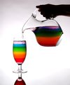
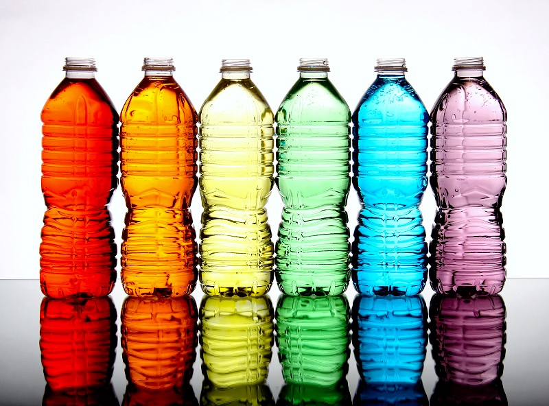
This is great, the balance between light and dark, the graduation of the colors. The only qualm I have with it is the symetry. It's almost perfect but not quite and my OCD just notices the water levels and that the bottles are facing different directions!
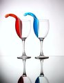
Well done. The color is lovely, and is what carries the image for me. It's a bit hot, I'm curious what 1 step down would look like, but it doesn't lower the score for me.
This is one of 4 very similar submissions in this challenge. Moreover, the idea was used previously with glasses, in a different challenge. After looking at all images, these 4 pictures get jumbled into "deja vu" zone and the merit of each one gets diminished by redundancy. I think that we shall strive for more imaginative solutions here, at DPC. I marked them all with 5 for effort and technical merit.
This would be Karen's shot I guess... Would have positioned the brighter colors to the outside where there's less light, the tops of green and yellow are a bit blown out. Had also preferred caps on the bottles, somehow it looks wrong without





 Add photograph to your favorites
 Add photographer to your favorites

 Photographer found comment helpful.


