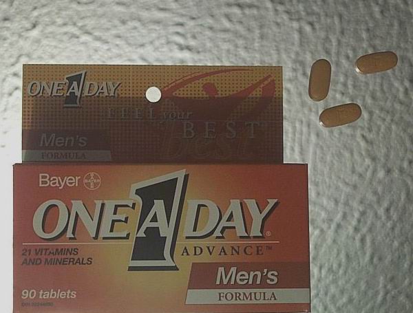
Love the concept. Do not like the exposure. It's too flat. Highlights are in the wrong place. Very cool stop motion on the tablets. But I have to give it an avg because of the exposure
This could benefit from adjusting the colour levels so that the black is true black. The back lighting was a good idea - keep practicing. The background texture is a little distracting,
This seems very washed out. I didn't like the choice of backgrounds, and I wish your colors were brighter and more crisp. Maybe contrast would have helped?
points for meeting the challenge and composition, not so many points for coloring and lighting. you might be able to claim 'this is the best i can do under basic editing rules.' maybe you might try this with different light sources that will allow the colorful box to pop?







 Add photograph to your favorites
 Add photographer to your favorites


 Photographer found comment helpful.


