I hate that I got this photo this week because I like it... It looks like I was your only 10 of the week though :( I don't quite understand that at all. I think this was an excellent idea. I think you simply got 'nitpicked' to death. Where there is an opportunity, it seems like the voter will take it... the score is decent though...
hehehe, how cool is this?! awesome idea and very well executed. perhaps cropped just a tad too close on the right, but not that big of a deal. i love it!
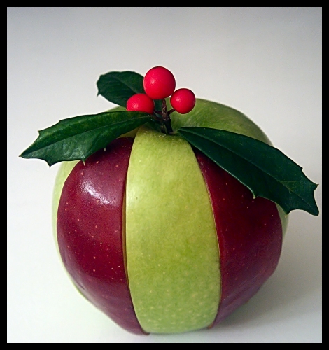
Interesting idea and a technically strong study. The only thing that doesn't work for me is the amount of shine at the base of the apple. It has an odd effect that draws my eye away from the holly on the top. The photo doesn't grab me, but is objectively very good.
Very original idea! Question, why didn't you continue the striping the whole way around the apple? (maybe because it wouldn't hold together like that?) Good focus, color, etc. How about an 8? Swash
Here´s a great job. Good colours, focus, lighting and background. The border is a little thick for my taste. I had probably mad it dark gray and 4-5 pixels. But this is a matter of taste. Overall a nice photo that could be a nice poster. (7)
Sorry I have to come in here again. I´m looking at it for the 10th time and now I have made up my mind. I have to change my score from (7) to (8). I really can´t say why it´s not higher - it has something to do with the cropping (framing). Sorry for not being able to be more precise. (final-8)
This is cute. I would like to see a bit more room on the right side so it was equal to the left. A little more detail on the berries would also be good they seem a bit blurred. = 7
Cleverly done :o) Perhaps a second light on the righthand side would help balance the image, and a slight adjustment on the crop so that the rightmost holly leaf isnt as close to the border might help too.
This is a really great idea. This is a christmas card for sure. I love it. The angle and framing/cropping is great. I like the added space at the top, and the border really sets this off. colors are great, as is the focus and clarity. I am not sure if I might like to see the bottom of the apple in focus or not. I think it's ok as is, but maybe I'd like to see it with the bottom in focus for comparrison. what a wonderful, pleasing to look at shot. Good luck in the challenge.
it is a very creative idea thats for sure... maybe too much so? since you can see what was done it seems a bit contrived... now if there was a way to make it look real, you would really have a shot!
Oh neat! Are the holly berries real? The almost look fake... I love the red apple peels on the green apple, but I think you should have gone all the way around the apple, it doesn't flow right on the top right side of the apple. the left red peelcould have been closer to the apple. Overall great concept, but could be improved slightly.
Good Idea, but I find the small gap between apple slices to be distracting. I imagine it was very difficult to put together, though. Good effort!
Smellyfish1002






 Add photograph to your favorites
 Add photographer to your favorites

 Photographer found comment helpful.


