| Author | Thread |
|
|
03/06/2011 09:53:58 PM |
|
It might have been the processing. I actually love this photo and gave it a 9. I felt that the grainy processing matched the heavy subject giving it kinda a gritty feel. I thought you did a great job dealing with a very painful subject. |
|
 Photographer found comment helpful. Photographer found comment helpful. |
|
|
03/06/2011 05:24:49 PM |
|
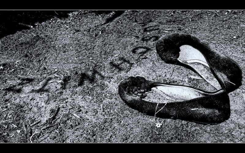
You asked for comments about why this entry scored poorly. I gave it a 5 which I think is generous. I don't think viewers should blame themselves for not noticing the tiny star of David, especially since its six points are hard to distinquish from the debris beneath it. Because I now know what the shadow spells, it seems obvious, but when I first saw this photo I couldn't decipher it. The photo seems cluttered and is grainy and hard on the eyes. My personal dislike of the use of certain frame techniques comes and goes; for some reason I don't like it here. I think it's a terrific idea for a photo and I have no objection to the staging of it, I just didn't "get" it visually and like a visitor to a gallery I often don't read the title of an artwork unless I feel compelled to, so calling it "Holocaust" might have been lost on me, I'm afraid! |
|
| Photographer found comment helpful. |
|
|
03/06/2011 05:11:53 PM |
|
The main problem is that you must look at this photo for longer than the average DPC usually gives it, especially with the high number of entries in this challenge. I personally did not catch the meaning, the words are hard to make out, as well as the little necklace. So I could only judge it on technicals, and is probablly what most people did. |
|
| Photographer found comment helpful. |
|
|
03/06/2011 03:57:02 PM |
|
Good concept, but the over-sharpening gives it a noisy feel and makes it unpleasant to look at for too long. Also, the shadow almost looks like black powder poured onto the ground. |
|
| Photographer found comment helpful. |
|
|
03/06/2011 11:48:02 AM |
|
I think you maybe over thinking this. I didn't vote in this challenge as I didn't have time, but had I done so, I would likely have given it a 5. Nothing to do with the subject matter, I think it's a good idea and well composed, but because on my calibrated screen it feels so heavily sharpened that it is not pleasing to look at, for me, at least. |
|
| Photographer found comment helpful. |
|
|
03/06/2011 11:45:45 AM |
viewing this now after the challenge and not comparing it to any other shoe pics i realize that i should have voted it higher. i guess that means voter fatigue was a big factor, there were just so many shots of shoes on the ground that this one didnt stand out at time of voting.
i do think that the ground is too busy. i JUST noticed what looks like a star of david necklace coming out of the shoe, i had to look at the pic a couple times over the last couple minutes before i saw it. i think the clutter in the ground caused me to miss this the first time around and its a detail that really brings the pic together for me now.
during voting i understood the emotion you were going for but i dont think it quite hit home with me, reading through your list of reasons i think #3 would best describe why.
to sum up: #1, 2 and 3. |
|
| Photographer found comment helpful. |
|
|
03/02/2011 01:17:53 AM |
I don’t really understand why this scored so low. This was one of my 9 votes (no 10’s from me this challenge). I personally feel some people may vote low on images that create sadness. My own Free Study may be suffering from this as well right now.
Please don’t let the result despair you as there were at least 23 voters who you reached with your hard work and great idea. Thank you for this image.
|
|
| Photographer found comment helpful. |
Comments Made During the Challenge  |
|
|
02/28/2011 02:24:00 AM |
|
Strong use of powerful emotion from an ugly history. I hope this is not lost on too many too young to remember. The title really moves me. Well done! |
|
| Photographer found comment helpful. |
|
|
02/24/2011 06:33:44 PM |
|
Touching composition. Some old shoes would add authenticity. |
|
| Photographer found comment helpful. |
|
|
02/24/2011 06:31:44 AM |
|
Different interesting shot. Good composition. |
|
| Photographer found comment helpful. |
|
|
02/24/2011 12:30:48 AM |
|
|
|
02/23/2011 05:50:31 AM |
|
Theme:
Classic /
Light /
Dark
Home -
Challenges -
Community -
League -
Photos -
Cameras -
Lenses -
Learn -
Help -
Terms of Use -
Privacy -
Top ^
DPChallenge, and website content and design, Copyright © 2001-2026 Challenging Technologies, LLC.
All digital photo copyrights belong to the photographers and may not be used without permission.
Current Server Time: 10/15/2026 12:01:11 PM EDT.






 Add photograph to your favorites
 Add photographer to your favorites