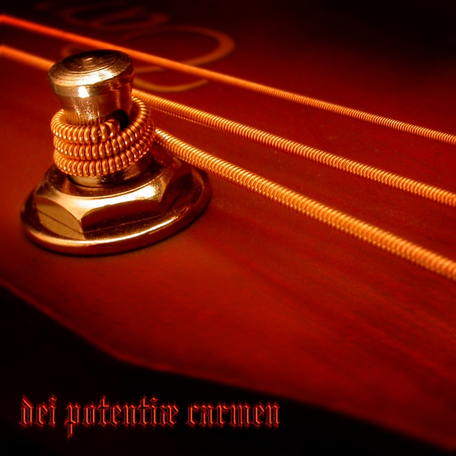
It is my pleasure to provide comments on this unique and wonderful image. You've done so many things right: composition, lighting, aperture selection, and placement of the text. (Many folks went way overboard on this challenge - especially with the multiple and gaudy fonts and colors.)
Your subject is simple - and your choice of depth of field adds mystery. I'd guess many did not realize what they were looking at but still liked the graphic colorful presentation.
I don't know whether you planned the black area for the placement of text when you set up ythe composition - or it just happened. In either event - it is perfectly placed. The fact that the words don't really mean anything - or if so - most peolple would not know the meaning - may have cost a point here and there. But "DPC" is not the easiest acronym to develop.
Improvement areas: I usually try to find something to leave as a tip - but I honestly don't think you could have done this any better.
Congratulations on a great entry.
I am a bit curious why you requested a cc critique as it doesn't appear you read comments - or else don't elect to mark any as helpful.
Didn't do a very good job of translating what I am only guessing is in latin but I'm thinking something to do with songs and poems. Love the image and the strong orange tint. Text works very well in colour, font and position. 9






 Add photograph to your favorites
 Add photographer to your favorites


