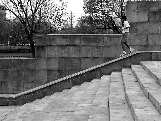
I like the diagonal like formed by the steps. It's gives a strong visual clue of motion. This is the first picture I noticed that took advantage of lines to convey motion.
Ironically I like everything except for the runner. His feet are placed too close to eachother so it doesn't imply enough movement. This would have been great if he had been jumping down that downgrade.
His head gets kinda lost in the trees, I think it would look nice if he were completely in front of a wall. The black an white works really well for this subject!
Another one where I think the use of B&W was questionable. There's not enough contrast or tight enough framing between the runner and the background to really make him or her pop out, I almost didn't notice her at first!
Lovely shot. Good composition, with strong leading in lines and some good diagonals. Jogger is placed well, with plenty of room to 'run in to'. Could have been a bit tighter cropped into the top, to hide the sliver of sky in the top right. Also the jogger might have been better seconds earlier, when against the stone, rather than infront of the tree. Great entry.
Its a decent picture.. I might have zoomed in a bit closer to the guy.. he gets a bit lost amongst the background. Does the use of black and white add anything to this picture?






 Add photograph to your favorites
 Add photographer to your favorites


