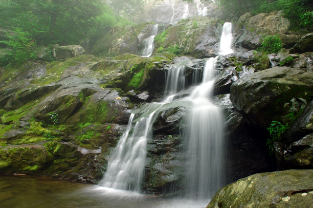
Dark Hollow Falls, early in the morning. A strong fog over the region added some mystical qualities throughout Shenandoah. The park is truly beautiful and I recommend that everyone visit. I got back late and hadn't had time to look over my pictures fully, but I am happy with this shot. I didn't have a neutral density filter and had to shoot at minimum aperture to blur the water. Unfortunately, the image is a little soft overall because of this. As for the challenge connection, this reminds me of either an Enya album or the "Pure Moods" album that was sold a few years ago. It could also work well as a Christian rock album cover.
Adjustments: Fine-tuned white balance & exposure in Nikon Capture, Levels, saturation, cropped, resized and unsharp mask in Photoshop
Full Exif Details:
Nikon D70
2004/07/25 09:25:22.8
RAW (12-bit) Lossless
Image Size: Large (3008 x 2000)
Lens: 18-70mm F/3.5-4.5 G
Focal Length: 18mm
Exposure Mode: Aperture Priority
Metering Mode: Multi-Pattern
1/1.3 sec - F/22
Exposure Comp.: 0 EV
Sensitivity: ISO 200
Optimize Image: Landscape
White Balance: Cloudy -2
AF Mode: AF-S
Flash Sync Mode: Not Attached
Color Mode: Mode IIIa (sRGB)
Tone Comp: Auto
Hue Adjustment: 0°
Saturation: Normal
Sharpening: Medium high
Image Comment:
Noise Reduction: OFF
Statistics
Place: 90 out of 122 Avg (all users): 5.0864 Avg (commenters): 4.9167 Avg (participants): 4.8652 Avg (non-participants): 5.2366 Views since voting: 980 Views during voting: 357 Votes: 220 Comments: 12 Favorites: 0
Really nice long exposure, might have liked it if you'd moved to the left a little to get rid of the rock on the bottom RHS or to make the waterfall more centred.
You captured the water beautifully. I would rather see the large rocks on the right side cropped leaving the falls close to the border. The hazy look on the left of the falls is good. You're probably being scored lower for not having the name of the band on the cover too.
This one doesn't work too well for me as a name or album cover. It seems like the band name was shoehorned to fit a photo that was taken during the time frame. You were probably unaware until entering, that text could be added for this one. That probably would have helped convince me this was an album cover. I almost missed that too, but I had a couple of hours left to work on it. I sympathise because this is probably hurting you in the scores.
The photo is quite nice. The composition is great and the blurring water is very effective. It's all over a bit contrasty, especially the rocks on the right side of the frame. The middle values are a bit dark and there is very little detail in the shadow areas. This is a shot that could be heightened dramatically with some highlight dodging.







 Add photograph to your favorites
 Add photographer to your favorites


 Photographer found comment helpful.


