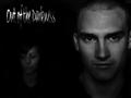
I think the knife a bit un-necessary as the eyes in this image represent the title quite well with out it. the reflection on the left of the knife is a distraction as well as the reflection from it under your(?) eyes. Keeping the same composition of the head shot and the text, it may have been OK to have the knife held to your left, straight up and down, parallel to the head with the text over it. Just a thought. THe head shot is great.
Love the catchlight in the eyes.
Focus is pin sharp.
Love the font on your text. Very well done. Excellent job!!!
Side note: I mentioned this in a thread earlier this week, I can see your photo skills improving at a phenomenal pace lately. You are obviously experiencing a growth/learning spike right now. Ride it out! (MHO)
Hello theo. Nice shot, interesting take on the challenge with the name. But you can't hide behind the knife, you have very distinct eyes.
The light on the knife is a bit blown out and I'm not really sure I like the halo created by the light around the edges of the knife, it really doesn't add to the shot for me. I'm a basically peaceful person so this particular album cover wouldn't appeal to me on an overal sense. A 7
I really don't like the band name. It sounds very awkward. Maybe Deeply Pierced Cut would have worked a little better? The text looks over Photoshopped to be authentic. The photo works well, although the glowing edge of the blade against the skin looks strange.






 Add photograph to your favorites
 Add photographer to your favorites


