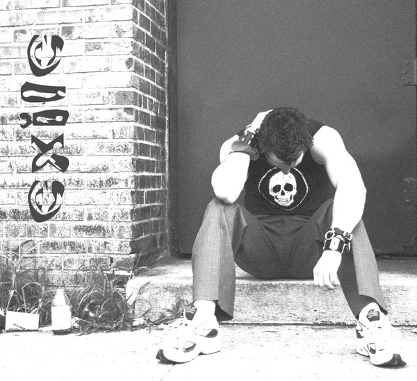
Not a whole lot to this shot... first, I began with a crop, ditched the colour for grayscale & converted to 8 bit from 16. Quick adjustment of levels, trying to find a nice medium from those who have uncalibrated monitors to those who have calibrated monitors. I then added a filter, film grain. I cloned out the door handle from the door & any hint of the bottle being snapple and added text. Finally a resize & we were good to go!
Statistics
Place: 74 out of 122 Avg (all users): 5.2765 Avg (commenters): 6.8750 Avg (participants): 5.0116 Avg (non-participants): 5.4504 Views since voting: 1266 Views during voting: 363 Votes: 217 Comments: 10 Favorites: 1 (view)
Nice idea but too washed out. Over exposure's fine but it really needs to have solid black and pure white at both ends of the scale. In this instance you need to reflect some angst so more dominant, heavy contrast would work better. Type is pretty good and nicely layed out.
I like how the composition works on this one. Nothing is quite centered or on the thirds so it creates an unbalanced tension and the man is placed in a box which adds to the feeling. It's just a shame that it looks overexposed on my monitor. That could work if you were allowed to add different layers to the composition, but for here I would like to see more details. I like the addition of "exile".
I like this shot, but would suggest a little more grain, or editing the blacks (such as the shirt and the text on the wall) to be a little darker - they appear gray on the monitor I am using, I will recheck this. Other than that, I like the subject and composition. The highlights aren't bad, but maybe in a little more moderation (maybe less on the sidewalk, while leaving the elements on the person overexposed). Overall a nice job.
Nice pose and composition. To be perfectly honest, there are some photos that look good with a high key effect, but I don't think this is one of them :) I think it would have looked good with a darker tone to reflect the mood and pose the person is in, but thats only my taste, i'm sure you liked this effect. (6)
The type of image I like which shows the album name and associates the picture with that rather than the groups name.
Could imagine this on the shelf in music store.
Good work..9
I think your going for a look here. Almost got it but the model's shoes and pants ruin it for you. Black jeans with doc martens maybe?
Some people will say overexposed but your going for an effect here. Good job.
I Love the name of the band. Sounds like someone I might listen to. On my computer it appears a little overexposed. I dont know if that was your intent. I gave you the benefit of the doubt. Good Job.
dc





 Add photograph to your favorites
 Add photographer to your favorites


 Photographer found comment helpful.


