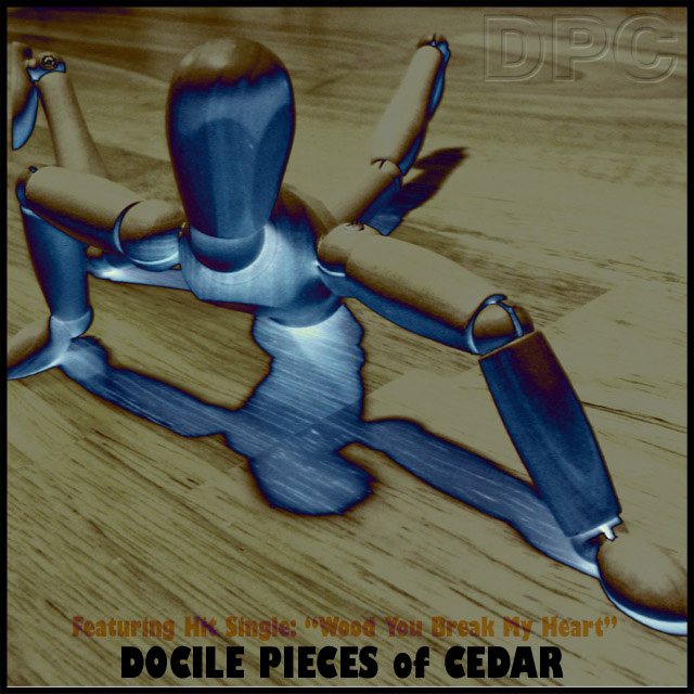
This shot is awesome.. a rare instance where the effect used really improved the shot and doesn't come out looking cheesy. The composition and feeling of depth is impressive as well. However, in my opinion the band name is downright horrid. Certainly seems like an attempt to fit the shot into the challenge. (The lousy pun hit single also would have been better left out.) Regardless of that, this was a pretty open challenge so I'm more interested in the photo than the rest, and the photo is great.
Fantastic concept!!! I don't know that I would be overwhelmed with the photo as a standalone piece of work, but it is perfect for drawing attention to the album and supporting the title. Your creativity on the title is what puts this over the top.... you managed to connect DPC back to one of the more interesting themes from the site.
this was a really sweet cover but you like many others in this competition need to take a look at your selection of fonts, typography is an art and the image and text meld into one statement. Really liked it much better when I didn't see the bottom text. Nice still the same





 Add photograph to your favorites
 Add photographer to your favorites


 Photographer found comment helpful.


