You say you were desperate but you have done a lovely job on this.
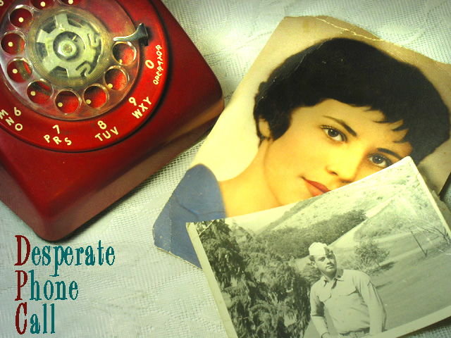
It shows a lot of thought. (Your mother is a very beautiful lady. What georgous eyes she has!) and yes, your Dad is very handsome also
I like the feel of this and looking at your comments I am not the only one.
The text looks alright to me it almost looks like embroidery which adds to the old sort of look
I am not very technical and I agree with you that photographs are very hard to photograph but you have done an excellent job with this
Your score is a very decent one and I myself think it should be higher
There were a lot of excellent entries, and this is up there with the best IMHO. The only small picky bit would be the little bit of harsh light middle top.
Keep enjoying your photography
Good luck in future Challenges
If you have any questions please feel free to PM me
Regards
Sally
Thanks for all the great comments! It's very gratifying. Especially seeing the average score from commenters. I feel almost like this photo was cheating since I used a gorgeous photo of my mother as part of the composition. Isn't she beautiful? The marine is my dad--a very handsome fellow, IMO. :-D
I really did work hard to find a good angle and cropping. Photographing photos isn't easy, I've discovered.
I used a desk lamp and Home Depot reflector, both fixed with 75 watt Natural light bulbs. To get even more of a vintage feel I slightly oversaturated the color. It works because most of the set-up has neutral or white so only the phone and my mother's photo got saturated. My daughter suggested doing something to brighten the phone a bit, since it appeared drab to her so I used the dodging tool on a corner of it and the tablecloth. This gave the appearance of sunlight spilling through curtained windows, I thought. At any rate, it passed my daughter's inspection.
I didn't know we could add text until almost the last minute. Fortunately, I had a decent area of negative space where I could insert it somewhat believably.
Originally posted by dagaleaa:
I like this....reminds me of an album cover from the 80's....
I thought the same thing. My husband furthered that idea by suggesting it looks like cover art for an 80's single.
Great lighting and use of the props. I have two suggestions for making it even better - 1) Put a phone number in the circle designed for it and 2) Make the text all on one line - probab;ly smaller onm the left bottom.
I like this one, so many storyes can be said by looking at it... verry good colors and composition. I like how you aranged all the pieces to tell this story.
This one is just stunning. Theres still one thing, the letters in the bottom left corner are too close to the bottom border, the space to the left should be the same as the space on the bottom. If you know what I´m saying. I give it a 9






 Add photograph to your favorites
 Add photographer to your favorites

 Photographer found comment helpful.


