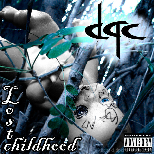
I know how the image looks. I was going for a look that alot of hard or puck rock albums go for. Every thing was done on purpose from the grain to the placement of the doll. So pick away at it if you must. I like it and it turned out just how I wanted it to. And please don't think this was just a bad image that I tried to make "work" for the challenge. It was a pre- planned.
Statistics
Place: 40 out of 122 Avg (all users): 5.7973 Avg (commenters): 7.3846 Avg (participants): 5.6304 Avg (non-participants): 5.9154 Views since voting: 1194 Views during voting: 409 Votes: 222 Comments: 17 Favorites: 2 (view)
A very complete designa and one that works well for me. The only thing I dislike is the design of the DPC text/ logo, it's size and the faded effect around it. 9







 Add photograph to your favorites
 Add photographer to your favorites


 Photographer found comment helpful.


