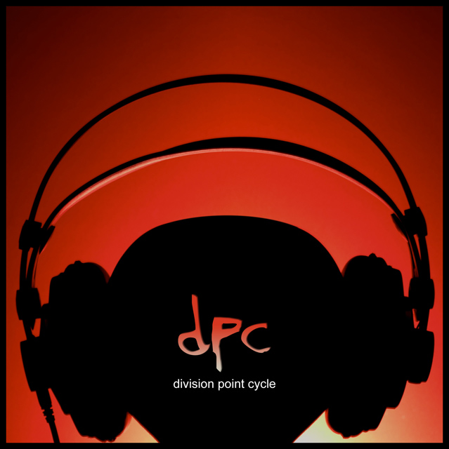
This was hard challenge, I had alot of ideas that didn't pan out, including this one. This is not quite what I wanted to achieve but I think it came out ok.
Statistics
Place: 7 out of 122 Avg (all users): 6.6606 Avg (commenters): 8.5556 Avg (participants): 6.8043 Avg (non-participants): 6.5556 Views since voting: 2172 Views during voting: 379 Votes: 218 Comments: 22 Favorites: 1 (view)
Only way to describe this.... Perfect.
The DPC acronym, simplicity in design, and urban feel scream album cover.
Photographically, the composition, use of lighting, and color palette totaly work. One of my pics for a ribbon..... 10
Great graphical editing. I love the negative effect with "dpc" and the background. Overall a great cover. If I had to nitpick, I'd suggest a slightly lighter font -- I'm guessing that's Arial, and it seems just a bit heavy to me personally. 8.
This is fantastic, I want to vote highly for it but i'm not a paying member (can't vote) so i just had to leave a comment so i could give it some sort of recognition.






 Add photograph to your favorites
 Add photographer to your favorites

 Photographer found comment helpful.


