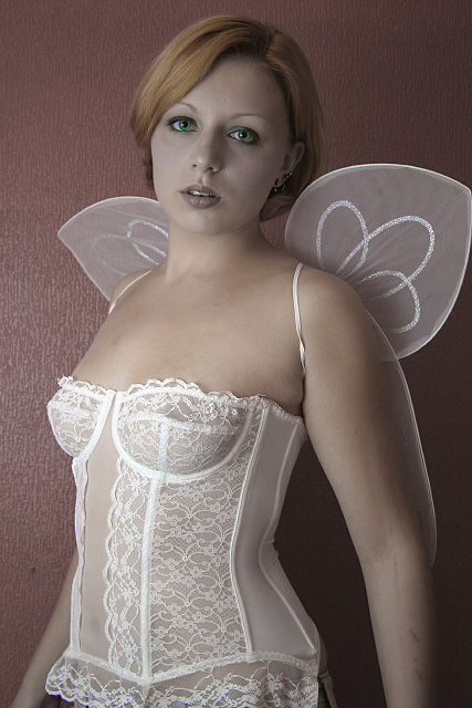
Pushed the levels a little, and USM'd, then selectively desaturate the red (not fully), and pushed the blue and green, for her natural eye colour.
The original had a lot of red via the walls, so it was quite easy to tone that down.
Nina was introduced to me via someone I met in a night club and handed one of my business cards to.
We had an initial meet and agreed to do the shoot the following day. She had never ever modeled before, but every pose she hit was spot on... If she decides to go pro, I think she will go far.
Statistics
Place: 141 out of 363 Avg (all users): 5.1049 Avg (commenters): 6.0625 Avg (participants): 4.9926 Avg (non-participants): 5.2197 Views since voting: 2863 Views during voting: 612 Votes: 267 Comments: 36 Favorites: 6 (view)
I wouldn't mind having her as my everyday object ! :p
Nice photo regardless, I think you derserved better
scores. I cannot believe 11 people gave you "1's" , they
need a trip to the optomertrist quick !
If I had been able to do more editing on the photo there is a couple of things I would have done....
I'd probably have de-saturated (or at least toned down) the whole photo, with a second layer that retained the original colours then erased the semi-de-saturated layer to reveal the eyes.
On the photo, i definatly overdid the selective de-saturation as IMO the face looks to "grey," perhaps if she had worn blue/purple lipstick the impact would have been better.
I was quite supprised at the number of low scores I recieved.... shame the reasons wernt given apart from the people that commented both good and bad... after all without the comments how can one gather the reasons?
I do know I was bumped down for "not meeting the challenge," but for me I took object to mean any physical object (and not the conitation that a woman is an object) and as I see the woman in question just about every day... it [the photo] fulfills the everyday criteria part.
I have to also say.. the guy that did the toilet paper on the lass... that one should have done very much better as it was a cracking take on the challenge and was definatly thinking out of the box. While It didnt do as well as I feel it should have, it was the kind of lateral thinking that would probably make a fortune in the advertising industry.
WOW!!! What an incredible model! Those green eyes are just...I'm speechless. Wow! I think I'm in love... An awesome photo. She is...wow. I'm absolutely stunned. Please excuse me now while I go wander around aimlessly thinking about this photo. Wow.
Nice photo, good light on the face, there's a bit of a reflection off the wall, which takes away from the soft look of the photo. As it stands, however, I don't think it is a very "everyday object".... Hmmmm unless.... are you saying that fantasies are an everyday object??? If i read it like that it fits the challenge! I'm going to change my vote now... Hopefully that is what you meant!
I don't personally use these objects everyday (or ever for that matter) and most of the time, I'm a stickler for making sure the photo fits the challenge... but this time, I'm going to make an exception because I just love the lighting and pose. :) And her green eyes are spectacular! Good job.
Nice angelic image but there are a couple of things that bother me. The way the wing elastic goes around her arm really cuts and disjoints her arm from her body. Either a looser strap or something more closely colored to her skin might help. The lower wing edge kind of grows out of her shoulder and at first glance I thought she had a really huge arm. Perhaps some back lighting to define the wing and make it look less like it's part of her arm.
Might also move her further away from the wall to gain some separation so the wall texture doesn't play as big a role.
An everyday object??? Yeah, right! :) The glare on the background is somewhat distracting, as is its texture and color. What this image needs is something to add a surreal quality. I'm no portraiture expeert, so it's hard for me to point out exactly what that would be. I might start with trying a soft focus.
although I like what you did with her eyes, her face came out too dark, which I felt made her look a little lifeless. good composition, but I feel the lighting could have been better






 Add photograph to your favorites
 Add photographer to your favorites


