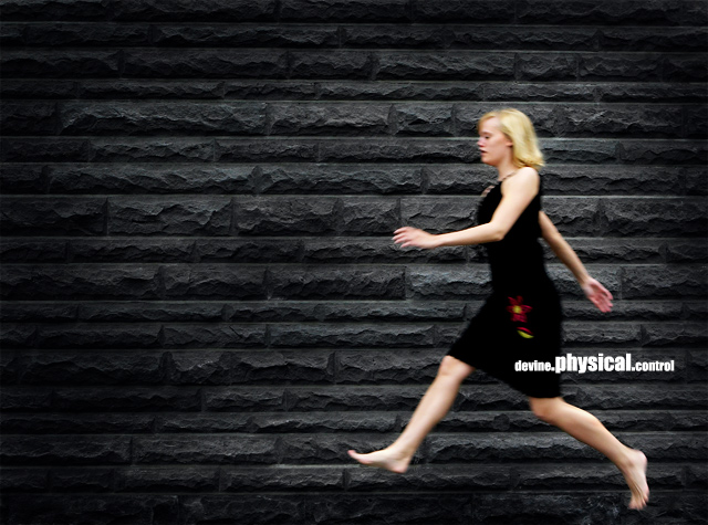
Wasn't sure about this one at first, but my eye kept coming back to it as I reviewed the entires. There's something urgent about her posture and the slight motion blur just plain works, I guess. Very nice cover!
What an AWESOME photo. One of my pics for a ribbon. Your subject, mood, composition, and artsy/urban feel really make this appear like an album cover. Nice work..... 10
Cool cover, I like the blur. Great choice of background too. Nice burning job to emphasize the subject. I also like the different sizes of the text. I would have cloned out that flower (or whatever it is) on her dress to make everything black. Great cover (8)
I really like this one.... i really like the darkening of the edges, and the capture of motion. I like the off-center composition and the fact that you put the title over to the right along with the subject.
Actually this would make a great album cover. Good Job!! I think i might like it better if the lady was not blurred, but for me the concept is a 10!!!!
dc
Very nice job. I wish your model didn't have so much motion blur.
But still, I stopped and looked at this one for some time.
Band name and album picture match well.
I really like this - the motion infront of the slatey brick wall works well - but I'd prefer to see an element of the girl in better focus - perhaps her face. That's just me though. This is the kind of thing I could see on a real cover.
Almost perfect! If you could have frozen the motion for at least her head this would have been an 11 and one of my all time DPC favorites. It's good... but I'm frustrated because it was so close to amazing....





 Add photograph to your favorites
 Add photographer to your favorites


 Photographer found comment helpful.


