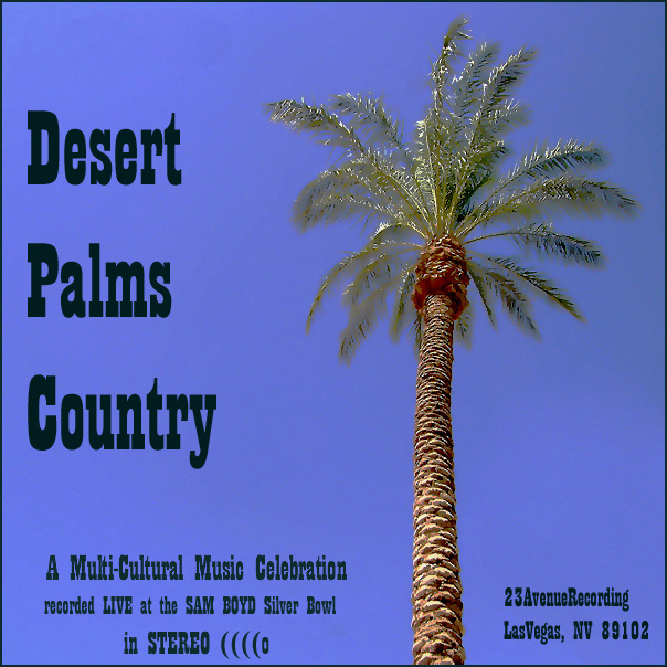
I think all the typing will do this one in. The palm isn't so bad and the post processing is ok for the challenge. The typeface is boring(sorry) and all the extra stuff doesn't add to the theme for me. Maybe there is an inside joke that goes with this, but I don't get it.
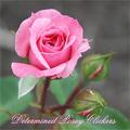
I'm not one to complaint about post processing, but I think that the treatment on the leaves might be a little severe. The grey of the back leaves is very close to the sky, and they blend in quite a bit.





 Add photograph to your favorites
 Add photographer to your favorites


 Photographer found comment helpful.


