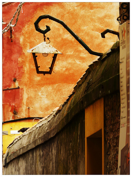
If this doesnt do as well as you were hoping for - these are things that get to me: The sign on the right is chopped off, The door doesnt have a bottom/base, the rope top left is a little distracting, it doesnt look that sharp. Looks too much like a quick snapshot to be DPC friendly.
The leading line of the roof is nice and the placement of the lamp is good too.
Love the rustic warm colors in this composition. This is a really pleasing study in lines, shapes and color. The hues of red, orange, and yellow are warm and vibrant. Love shape of the lantern and the way the hanging post curls with swooping lines. I do have a small critique. I think that the composition would be stronger if you cropped out the distracting sign seen at the far right.






 Add photograph to your favorites
 Add photographer to your favorites


 Photographer found comment helpful.


