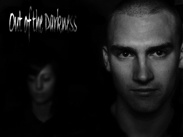
My daughter and her boyfriend who kindly agreed to pose for me in the garage which was the only place I could get the right kind of light for the shot.
Don`t imagine that this image will do too well as I`m not the best at portrait stuff..plus the format wasn`t 1:1 which some people may be looking for.
Adjustments to Contrast and sharpness.Background darkened and blur added to my daughters face to push her into the background (and also to ensure that she wouldn`t be recognised from a previous submission)
Image desaturated and text added..a little burning done to darken the text in places.
Image resized and a few minor marks cloned out.
Statistics
Place: 47 out of 122 Avg (all users): 5.6728 Avg (commenters): 7.4545 Avg (participants): 5.6364 Avg (non-participants): 5.6977 Views since voting: 1089 Views during voting: 352 Votes: 217 Comments: 14 Favorites: 2 (view)
Wonderful. I really like the way you composed the portraits! The female is very mysterious - and the male quite striking. The only small detractor is the words "out of" seem to be a bit hot. Should finish very high - but gosh - there a LOTS of great submissions.
Awesome photo! Band name is so so...I feel you could've done a better job of matching name to picture.
Still, on the merits of the photo...an "8"
Love the font.
Superb design - remind me of some of Arnit's work (not in the sense of being copied but in the sense of creativity and in the ability to express enigma in portraiture). Not keen on the font choice but it's not awful either. 9
this is so werid - you two guys look almost exactly like superb band Lamb. this so very fits the challenge! i'm not greatly keen on the font - something a bit less, erm, scruffy (?) might suit a little better - something like the one i'm typing this out with, and in one bold colour. possibly not so big. that aside, i think it's dead impressive - and your models looks and poses are SO right for the band name. bravo you. for the photo - 10. but the title IS part of the overall look this week, so i think it feels more an 8.
Good band title. It sounds natural and authentic. The photo is perhaps a bit too dark. The foreground subject should have a bit lighter middle values in greater contrast with the shadows. And the other face should be a teensy bit more visible. I don't like the font choice at all.
Good composition and DoF. I think this will appear too dark on a lot of people's monitors and they won't even see the person in the background, which is a shame, cos the darkness is what makes the shot.





 Add photograph to your favorites
 Add photographer to your favorites

 Photographer found comment helpful.


