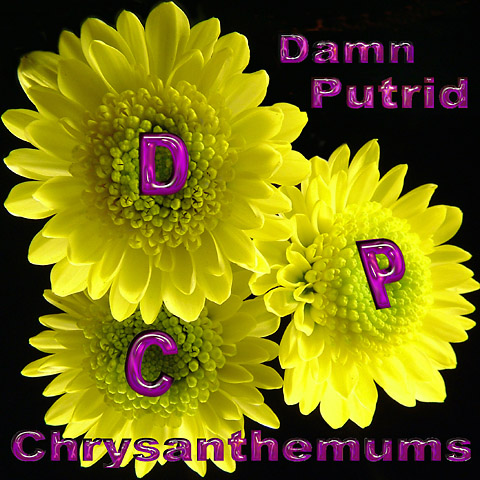
I'm here looking at this and wondering why it didn't do better...first off the flowers jump out and grab your attention so that is a plus. However, the font just doesn't do a lot, it looks good on the yellow and stands out but then it is almost to dark against the black.
Overall I like the image and it does meet the challenge. Nice work.
Message edited by HBunch - Removed Critique Club status.
This is a good shot, but the flowers are a bit too close to the edges of the frame I think. Cropping closer or further out would have made whatever choice you made more obvious, and made the photo more appealing, imo.







 Add photograph to your favorites
 Add photographer to your favorites

 Photographer found comment helpful.


