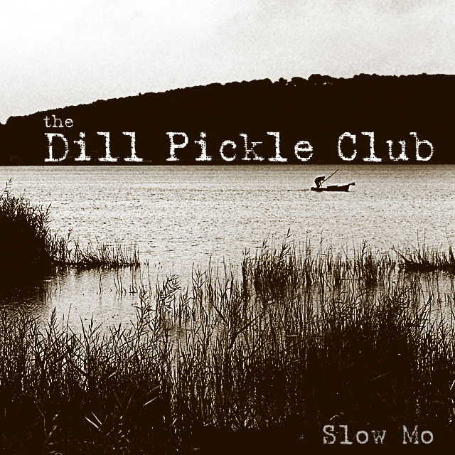
Though the title is a bit of a stretch for me, the image is excellent and is a very good composition. I love the silhoetted grass and boat in the midground. The monotone really sets a mood. Excellent.
This group name sounds like a deli sandwich. Maybe it because it's almost lunch time. Hmm. Excellent and creative! My only issue is the sky. It has lots of compression artifacts or maybe it's just noise. Otherwise, great job! 9
The font goes great with the grainy nature of the shot. I really like this, and could definitely see it as an album cover. Great eye for composition & the text placement. -10-
Could totally see this as a real band name, real album name, real album cover. Looks totally authentic to me! Love the mood of the photo with the large foreground and silouette of the fishman. Great!
Excellent choice of font and font texture. Also like the very high contrast black and white treatment. Composition works well. If I saw this in a CD case I'd certainly assume it was a real album cover produced professionally. 10
I like the placement and style of the text, very effective. The photo looks a bit oversharpened, but that actually adds somewhat to the 'style' of the cover text.






 Add photograph to your favorites
 Add photographer to your favorites


 Photographer found comment helpful.


