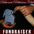
This is so well done - the band title works, simple photo highlights the band (as it should) the "R" is a creative touch, text font and placement excellent. One of my ribbon picks
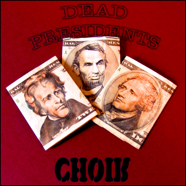
Looks a little soft, but in this case I dont think it matters too much. One thing I would suggest trying is to erase the parts of the word "presidents" where it overlaps the money. That way it will make it look like the text is behind the money. I think that would look quite cool.





 Add photograph to your favorites
 Add photographer to your favorites


 Photographer found comment helpful.


