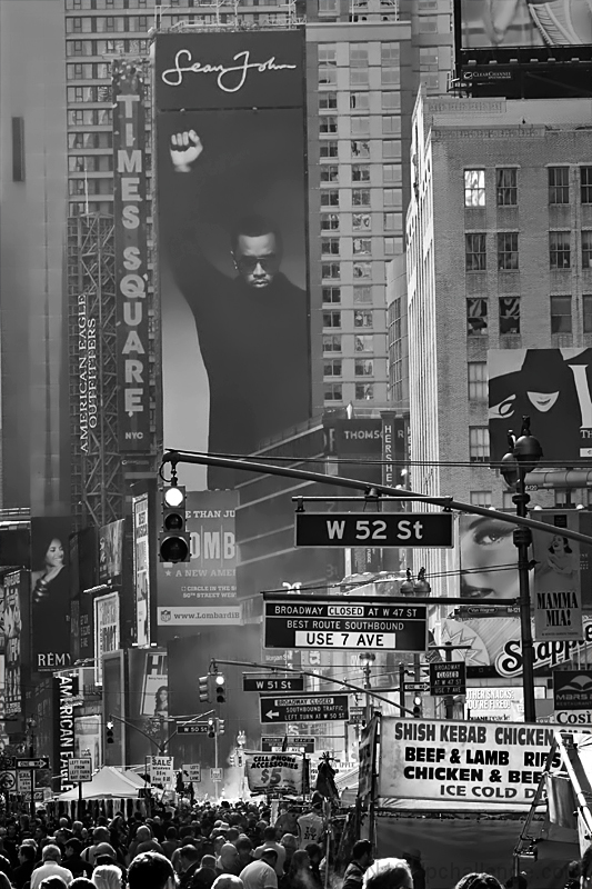
I scored the other one point higher but I like this one alot too. To me, they're two completely different pictures. I'm in Times Square almost everyday - the way you isolated the chaos of the signs, both compositionally and with pp on the first one is terrific. Including the crowds in this one - well, what came to my mind when viewing is - the huddled masses yearning to be free. This is perfect in portrait orientation - your view is outstanding, actually. And I love the title.
I agree with Bear's comment from the thread. The version submitted before was better because the focus was on the chaos and didn't include the looming shot of Sean Johnson. Perhaps if this was done in landscape format without him the shot would have scored higher.
I am surprized it didn't do as well as the other shot. I actually like the composition here much more. The stratification from solemnity and quiet at the top to the mess and fuss down below is so interesting.
I'm going through the entries, stopping at those images I feel have had the benefit of an unconventional eye and dwelling a little longer to try to see and appreciate what you saw. This is one of those images.
Positives: Larry, I like a number of elements in this image, the clarity of the signs in particular and the dominance of the Sean Combs billboard. The toning is excellent too - you have contrast in all the right places.
Critical stuff: I don't think this is as powerful as your October Free Study entry - the inclusion of the heads detracts from the image for me - I liked the other because it felt like I had just been helped to look up, to notice things.... Here I feel more like on of the masses... head forward, eyes down, move forward.
Overall: Nice, but for, it doesn't compare favourably with the other image.






 Add photograph to your favorites
 Add photographer to your favorites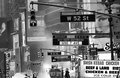


 Photographer found comment helpful.


