|
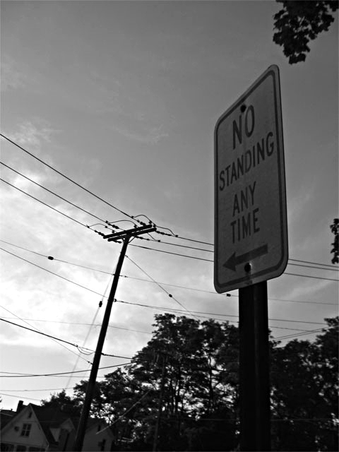
Photographically, this shot doesn't hold very much interest. Black and white is probably the best treatment for this, but I would suggest a different composition. If the house in the bottom left is to be included, it might be better if it was completely visible. Also, the angles created by the house and telephone pole do not work well with the vertical post, and are a bit blurry as well. I'd suggest shooting this from an angle a little further left to crop out the house and pole, and the use of fill flash or positive exposure compensation to brighten up the sign a bit. |







 Add photograph to your favorites
 Add photographer to your favorites


 Photographer found comment helpful.


