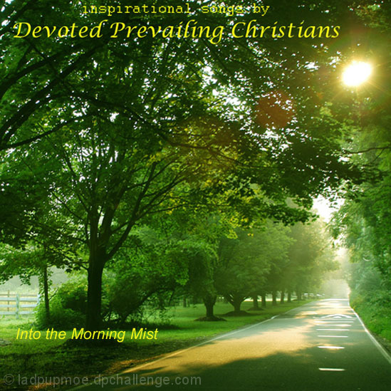
Overall it is a good idea, meets the challenge and has a strong appeal. What I don't like here is a SUNSPOT! There is a sunspot that could easily be touched up and would improve the overall image. Possibly had you touched that up you would have been looking at a 6 or higher. The title works well and was an excellent choice, it's just that sunspot the ruins the whole thing.
Kind of the idea I was going for in mine, but I wasn't explicit enough = P
If not for the flare from the sun, I think this would be a great shot. A tighter vertical crop should fix that up though. Nice work.
Great submission - the perfect image for religious songs. It does look like an album cover - I can see it on the shelf! My only problem is that you've used three different fonts - which was not necessary. Finally - I think a more "golden" font color would be better than the bright yellow. Overall - it's a rel winner!
Lovely shot here. Title is a bit weak.....picture would definately suit a "D........P.......Classical type of title. Still this is very pleasing to the eye. Good choice of colour on the font.
Nice composition using lines from the road.
The photo looks a bit soft. USM could sort that out. Also the text kinda gets lost in the photo. Try adding a black outline to it, and maybe a dmall drop shadow too.








 Add photograph to your favorites
 Add photographer to your favorites


 Photographer found comment helpful.


